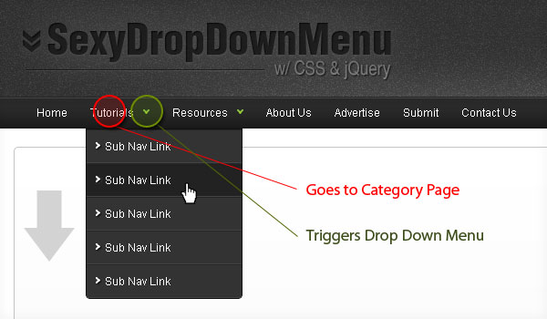
View Demo of Sexy Drop Down Menu
Step1. HTML
First create an unordered list for your base top navigation. Then simply nest another unordered list for your sub navigation.
<ul class="topnav">
    <li><a href="#">Home</a></li>
    <li>
        <a href="#">Tutorials</a>
        <ul class="subnav">
            <li><a href="#">Sub Nav Link</a></li>
            <li><a href="#">Sub Nav Link</a></li>
        </ul>
    </li>
    <li>
        <a href="#">Resources</a>
        <ul class="subnav">
            <li><a href="#">Sub Nav Link</a></li>
            <li><a href="#">Sub Nav Link</a></li>
        </ul>
    </li>
    <li><a href="#">About Us</a></li>
    <li><a href="#">Advertise</a></li>
    <li><a href="#">Submit</a></li>
    <li><a href="#">Contact Us</a></li>
</ul>
Step2. CSS
Next, it’s time to style the navigation wireframe with CSS.
ul.topnav {
	list-style: none;
	padding: 0 20px;
	margin: 0;
	float: left;
	width: 920px;
	background: #222;
	font-size: 1.2em;
	background: url(topnav_bg.gif) repeat-x;
}
ul.topnav li {
	float: left;
	margin: 0;
	padding: 0 15px 0 0;
	position: relative; /*--Declare X and Y axis base for sub navigation--*/
}
ul.topnav li a{
	padding: 10px 5px;
	color: #fff;
	display: block;
	text-decoration: none;
	float: left;
}
ul.topnav li a:hover{
	background: url(topnav_hover.gif) no-repeat center top;
}
ul.topnav li span { /*--Drop down trigger styles--*/
	width: 17px;
	height: 35px;
	float: left;
	background: url(subnav_btn.gif) no-repeat center top;
}
ul.topnav li span.subhover {background-position: center bottom; cursor: pointer;} /*--Hover effect for trigger--*/
ul.topnav li ul.subnav {
	list-style: none;
	position: absolute; /*--Important - Keeps subnav from affecting main navigation flow--*/
	left: 0; top: 35px;
	background: #333;
	margin: 0; padding: 0;
	display: none;
	float: left;
	width: 170px;
	border: 1px solid #111;
}
ul.topnav li ul.subnav li{
	margin: 0; padding: 0;
	border-top: 1px solid #252525; /*--Create bevel effect--*/
	border-bottom: 1px solid #444; /*--Create bevel effect--*/
	clear: both;
	width: 170px;
}
html ul.topnav li ul.subnav li a {
	float: left;
	width: 145px;
	background: #333 url(dropdown_linkbg.gif) no-repeat 10px center;
	padding-left: 20px;
}
html ul.topnav li ul.subnav li a:hover { /*--Hover effect for subnav links--*/
	background: #222 url(dropdown_linkbg.gif) no-repeat 10px center;
}
Step3. jQuery
For those who are new to jQuery, you can learn about it here.
The following script contains comments explaining which jQuery actions are being performed.
$(document).ready(function(){
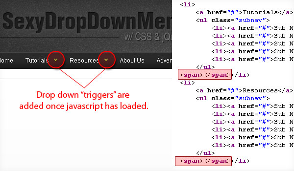
$("ul.subnav").parent().append("<span></span>"); //Only shows drop down trigger when js is enabled (Adds empty span tag after ul.subnav*)
$("ul.topnav li span").click(function() { //When trigger is clicked...
//Following events are applied to the subnav itself (moving subnav up and down)
$(this).parent().find("ul.subnav").slideDown('fast').show(); //Drop down the subnav on click
$(this).parent().hover(function() {
}, function(){
$(this).parent().find("ul.subnav").slideUp('slow'); //When the mouse hovers out of the subnav, move it back up
});
//Following events are applied to the trigger (Hover events for the trigger)
}).hover(function() {
$(this).addClass("subhover"); //On hover over, add class "subhover"
}, function(){ //On Hover Out
$(this).removeClass("subhover"); //On hover out, remove class "subhover"
});
});
*To degrade gracefully, we only show the drop down menu trigger to those who have javascript enabled.
This is what it looks like when javascript is disabled:

'Design' 카테고리의 다른 글
| ADOBE TV CS5 (0) | 2010.04.15 |
|---|---|
| cs4 licensing for this product has expired (0) | 2009.08.05 |
| ncredibly Realistic Water Text in Cinema 4D and Photoshop (0) | 2009.06.06 |
| Crear poster apocalíptico de una película (0) | 2009.06.06 |
| How to Turn Humdrum Photos into Cinematic Portraits (0) | 2009.06.06 |