Introduction
First off, you’ll export an InDesign template into Photoshop, then assemble a multi-channel, complex illustration. Then discover how to incorporate the same spot color information into your Illustrator files. You’ll then assemble all these elements using InDesign and utilize some of its’ advanced output preview features. Finally, I’ll show you how to export a printer-friendly PDF and give it a preflight check with Acrobat Professional.
Feel free to use your own images, but bear in mind the process we’ll be using doesn’t lend itself to every image type – for example the stock image of the girl is an ideal choice because of her silver dress.
Here's a list of images I used:
- The large version of the girl from iStockphoto
- The vector flourishes from iStockphoto
- The CD from stock.xchng
Final Image Preview
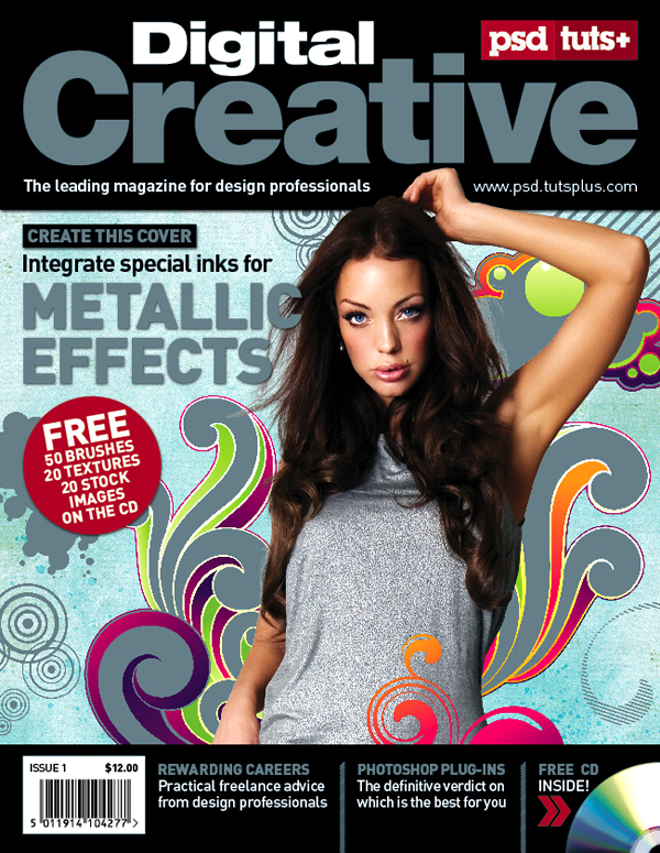
Take a look at the image we'll be creating. Want access to the full PSD files and downloadable copies of every tutorial, including this one? Join Psd Plus for just $9/month. You can view the final image preview below.
For PSD Plus Members, the Photoshop PSD file in a directory labeled "source" that came in the ZIP file that you downloaded. You may wish to look through it briefly before we begin. You'll also find other Photoshop files to complete the illustration, along with a low resolution PDF template, the completed InDesign file. A preview of the final image is below and a video to show the metallic effect.
The Print Process Explained
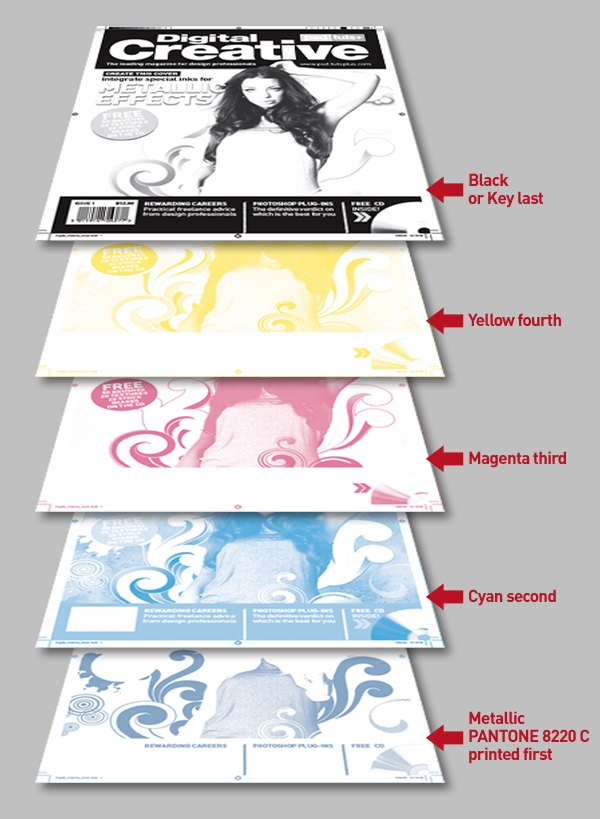
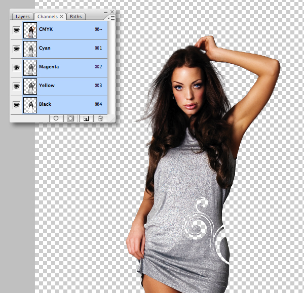
Offset printing is composed of four spot colors: Cyan, Magenta, Yellow and Key (black) commonly referred to as CMYK. Some colors are impossible to reproduce with CMYK alone, such as metallics. Nowadays many commercial printers have five or six color presses, so it's not uncommon for designers to integrate one, or even two extra spot colors. Take a look at your local newsstand and you'll see many magazines that have been printed with additional inks or special print finishes to grab your attention.
It's also vital to liaise with your printer before commencing work – he'll advise what's possible, as well as the cost implications. In this case the metallic PANTONE 8228 C ink would be printed first, then the CMYK inks would overprint – CMYK inks are slightly transparent, so for this to work properly, you need to knock-out selective areas to allow the pure metallic to show through. In other areas, such as the models' dress, we'll let the CMYK to overprint – for a subtle shimmer effect.
Step 1
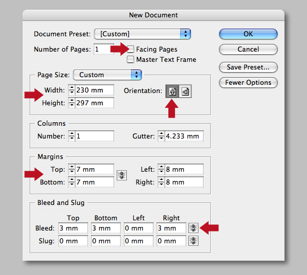
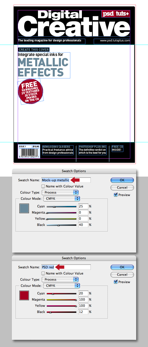
Start off by creating a new portrait InDesign document that is 230mm by 297mm. This tutorial only focuses on the cover design, so uncheck Facing Pages, set the Top/Bottom Margins to 7mm and the Left/Right ones to 8mm. Now add 3mm Bleed to the Top, Bottom and Right, leaving the Left at zero.
Step 2
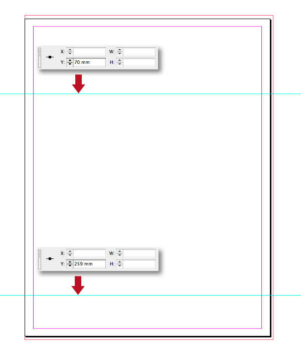
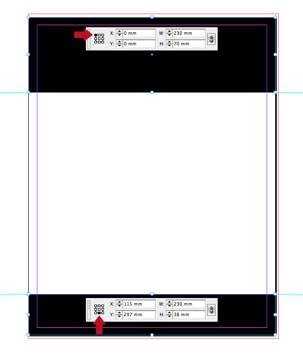
Ensure you're Guides (Command + Semi-Colon key) and Rulers (Command + R) are visible, then position a guide at 70mm and one at 259mm. For precision, simply highlight the guide and enter the amounts in the Y Location fields. It's also a good idea to hit Option + Command + Semi-Colon key to Lock Guides after, so you don't accidentally move them.
Step 3
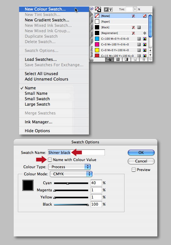
Go to your Swatches palette and use the fly-out menu to select New Color Swatch, then uncheck the Name with Color Value option and label it "Shiner black." Ensure the Color Type is set to Process and the Color Mode is CMYK. Now enter 40% Cyan, 1% Magenta, 1% Yellow and 100% Black. Adding 40% Cyan to the color breakdown makes a deeper or rich black. I'll explain why it's important to add the 1% Magenta and Yellow in the next step.
Step 4
Ensure that you've got Snap to Guides enabled (Shift + Command + Semi-Colon key), then draw a block (Fill set to 100% "Shiner black" and Stroke at zero). Select the Rectangle Tool (R) and draw from the top of the document, snapping to the first guide. Now select the block with the Selection Tool (V) to accurately check its coordinates and dimensions using the Reference Point Locator. Add another black rectangle to the base of the document, checking it's position also. Note, at this stage I'm not adding any bleed, I prefer this as a final step.
If you look at the final design, you'll see that the two black solids sit over four-color imagery. The reason 1% in each of the Magenta and Yellow is a fail safe just in case the printers' RIP is not set correctly and avoids the possibility of the black panels overprinting instead of knocking out any elements that run behind it. The 1% will automatically force a knockout – this is especially beneficial for large black font sizes. Mistakes are often made for black text, as traditionally it overprints, but if the text is above a certain size you may see the image or element behind it.
Step 5
Now to create the masthead – this is the visual branding of the publication, which needs to be instantly recognizable. I prefer using Illustrator for this part.
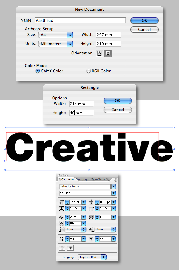
Create a new CMYK, A4 landscape Illustrator document and label it "Masthead." Now select the Rectangle Tool and click anywhere on the artboard. In the next dialogue box enter a Width of 214mm and a Height of 40mm. The width was calculated from subtracting InDesigns' right and left guides from the document width. The depth is not critical, just a rough guess of how much the masthead should occupy. Click OK, then hit Command + 5 to Make Guides.
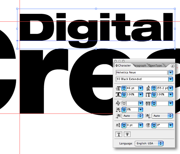
Now choose a font that's going to have the desired impact and shelf-presence – I used Helvetica Neue Black. Select the Type Tool (T), click on the artboard and enter your text. Next, adjust the font size to the depth of the guides.
Step 6
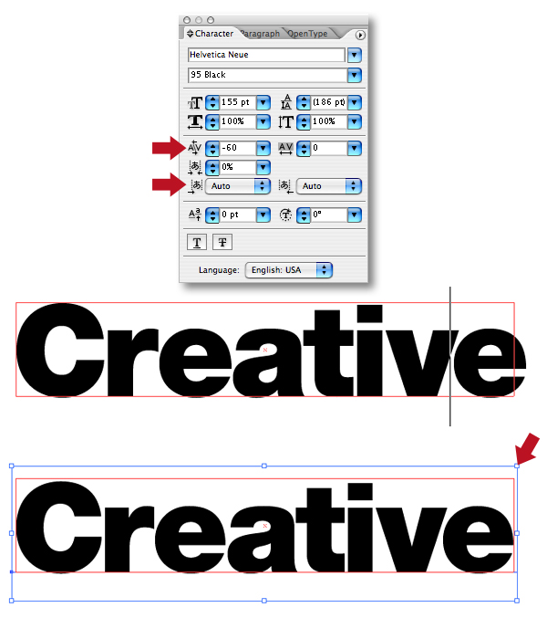
It's vital when using large font sizes to adjust the spaces between individual characters. This is called kerningand should not be confused with tracking which adjusts the spacing between whole words.
First make sure you've got the default Auto kerning option selected. Auto kerning uses the font's built-in kerning pairs. If the font has adequate kern pair tables (as do most fonts from major type foundries), this setting is usually the best choice. The Optical setting overrides the font's built-in kern tables so that Illustrator determines the spacing and kerning between all character pairs. This can be useful when a font has few or no built-in kern pairs, or when the overall spacing seems uneven.
Click between the characters you wish to adjust with the Type Tool. To kern in or out, hold down Option and tap the left or right arrow keys. Depending on which way you tap, you will see that the space between the letters is increased or decreased by 20 em in the Character Palette (an em is defined as a measure for 12-point type; a pica). In Illustrator's preferences, you can set the default em spacing to something lower which will increase or decrease the spacing in smaller increments if you wish.
You'll see that I've tightened up the spacing between each character by eye for a pleasing result. When you're happy, resize the text to your guides by Shift-dragging the top right corner with the Selection Tool V).
Step 7
Now add the smaller header, again Helvetica Neue but using Black Extended. I decided to range this to the r of the large header snapping it to a guide. Pay close attention to your kerning on the smaller header too.
Step 8
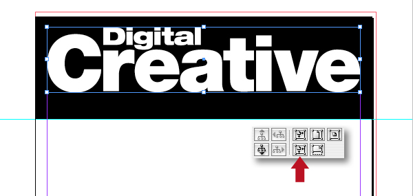
I like to think of a masthead as essentially a logo, so once you're happy, convert it to paths (Shift + Command + O), fill with white, then Save As an EPS file (Shift + Command + S) and name it "Masthead_outlines.eps."
Switch back to your InDesign file and with nothing selected hit Command + D to navigate and place it. Now snap it to the top margins and press Option + Command + H to enable High Quality Display. Depending on your placed file you may need to press the Fit frame to content option to tidy things up.
Step 9
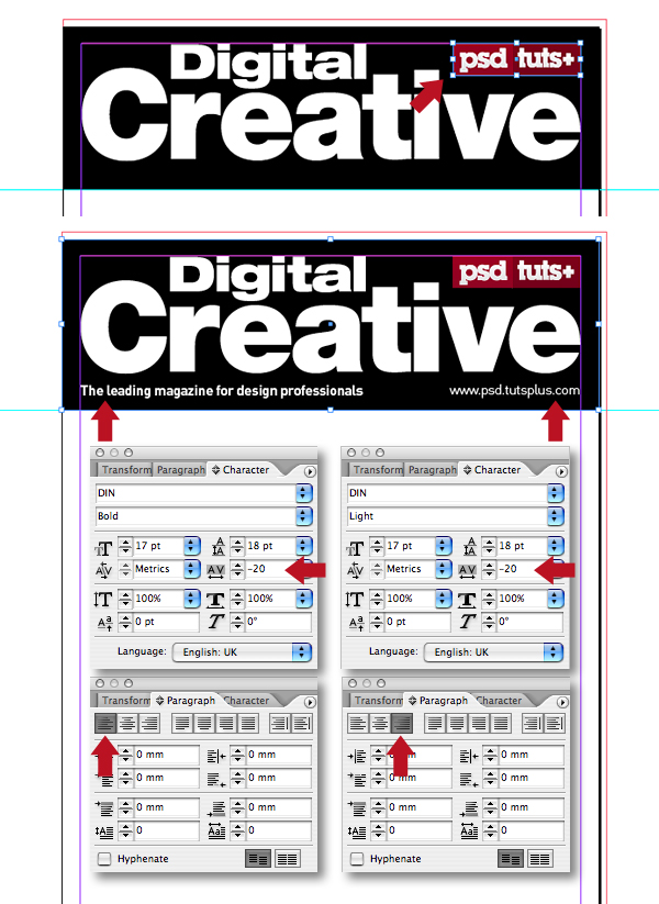
Place the"Psd_CMYK_logo.eps" from the "source" folder top right as shown and Command + Shift-drag using the Selection Tool to resize (or place your own logo). Now add the strapline – I used Din Bold ranged left at 17pt, there's no need to adjust any kerning here because of the small font size. Incidentally, InDesign calls its default kerning and tracking Metrics as opposed to Auto – I used a setting of -20.
Next, add the web address in a separate ranged right text box – I used Din Light at the same size and tracking. Be selective when choosing your fonts, I've only used two font families for the entire design; both Helvetica and Din have a variety of weights/styles that achieve a polished look. If you use a mass of different font styles, your work will look amateurish.
Step 10
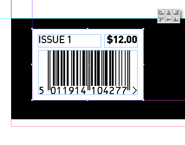
Add a white box, bottom left, then place the "Barcode.eps" from the "source" folder. Now add some further text as shown. You can now range/align these elements as shown and then group them.
Step 11
Drop in some more text along the bottom of the document, then divide using a 5pt lined rule. All these objects can now be selected and distributed equally using the Align palette.
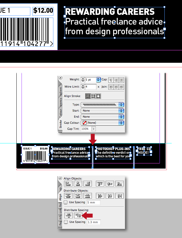
Step 12
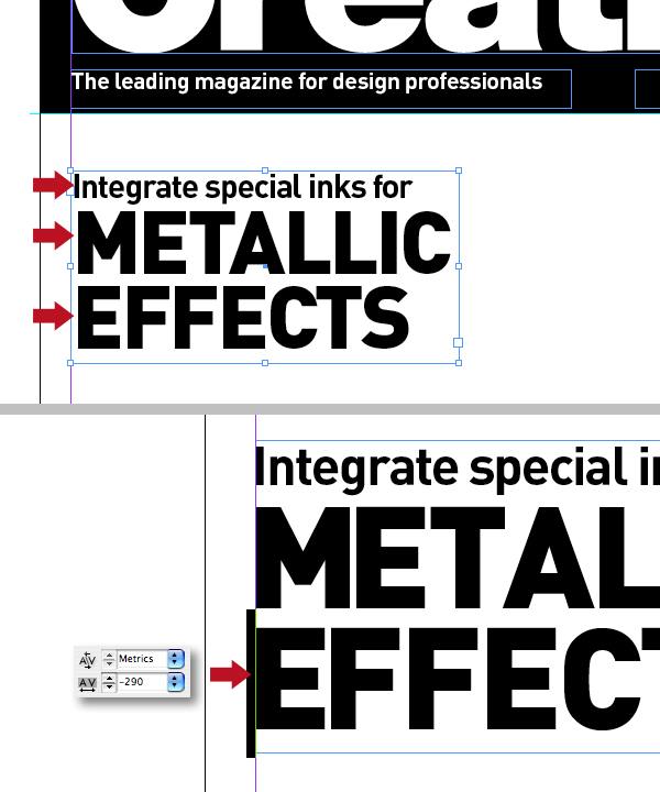
Now add the main ranged-left coverline as shown. Depending on your font usage you may notice some characters sit flush against the side of a text frame and others get inset a little, even when the text Inset values (inside Object > Text Frame Options) are set to zero. This is down to the fonts' left side bearing, also called overhang, or padding. When a font is designed, each character is placed on a grid, with the lower-left corner (the origin) at zero. The designer then has to decide how far from that origin the left edge of the character should sit.
Virtually all characters in all fonts have a little bit of a left side bearing. A few have negative or zero left side bearings and some have a fraction of a right-side bearing instead. If a font has no sidebearings, then the characters would overlap each other.
As a workaround you can trick InDesign by inserting a space before the first character, then placing the cursor between them and tracking backwards – I used a value of -290.
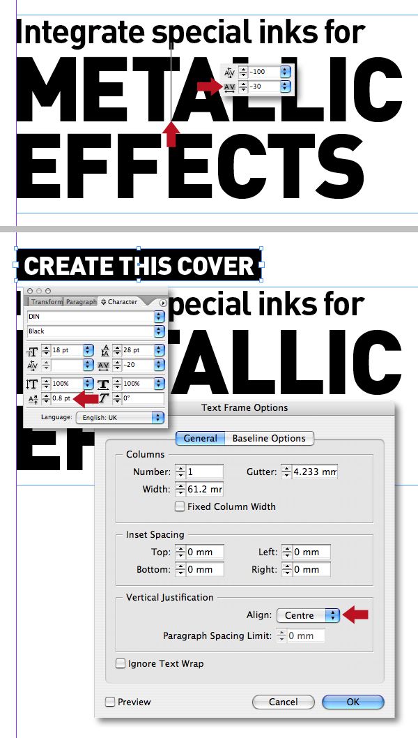
Step 13
Go in and track/kern your heading text as required, then add another text box filled with "Shinner black." Add some white-out text and select Align Center in the Paragraph palette. Now open the Text Frame Options (Command + B) and select Center under Vertical Justification drop-down menu. You may need to add a fraction of Baseline Shift – I used 0.8pt.
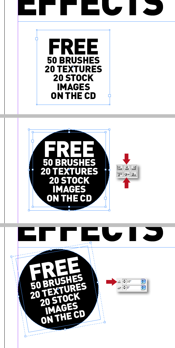
Step 14
Add another block of centered text as shown, then Shift-drag a circle and send to the back by hitting Shift + Command + Right Bracket key. Now align both objects centrally, then group and rotate 10 degrees. Finally, position just under the coverline.
Step 15
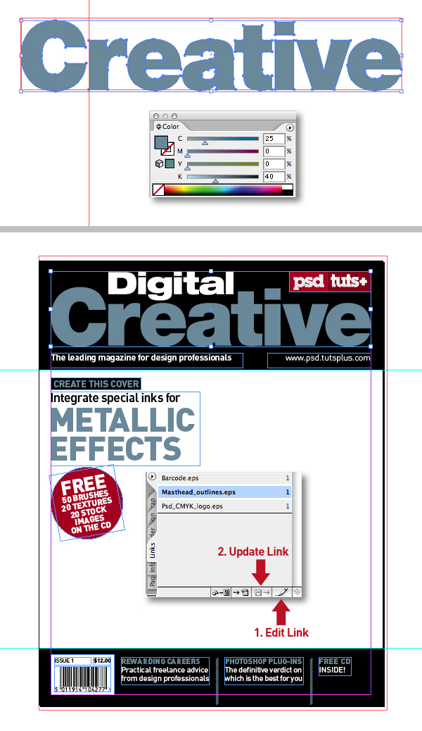
With the design almost complete, you can now color up some of the elements and text for greater impact as shown. Ultimately we'll be using a metallic silver ink, but for now make a CMYK representation by creating a new swatch labelled "Mock-up metallic" using 25% Cyan and 40% Black. Next, add another swatch labelled "PSD red" that matches the logo – I used 20% Cyan, 100% Magenta, 100% Yellow and 12% Black.
Step 16
Draw a rectangle, or any shape filled with the "Mock-up metallic" swatch and then Cut it (Command + X). Now highlight the "Masthead_outlines.eps" within the links palette, then click the Edit Original icon to open it in Illustrator. Now Paste (Command + V) the object, select the word "Creative" and click on the block to recolor the lettering using the Eyedropper Tool (I), delete the block, then Save. This is a quick way to color objects between the two applications. Finally, back in In Design click on the Update Link icon.
Step 17
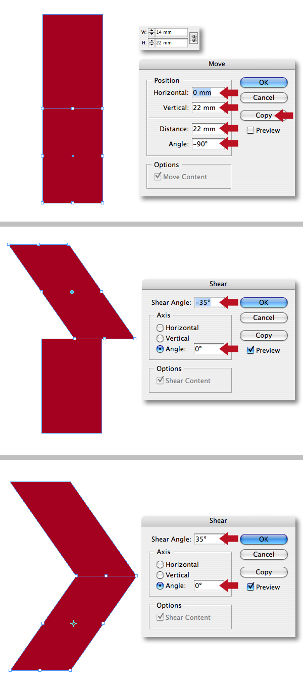
Let's add some small red chevrons next to the bottom right text – we'll be adding a CD graphic later to attract the readers' attention. Start by creating a rectangle filled with "PSD red" that's precisely 14mm Wide by 22mm High. With the shape selected press Option + Shift + Command + D to bring up the Transform Each dialogue box and use the following settings: Horizontal = 0, Vertical = 22mm, Distance = 22mm and Angle = -90 degrees, then press the Copy button.
Now select the original object, double-click on the Shear Tool (O), then give it a Shear Angle of -35 degrees and an Axis Angle of zero degrees. Finally, select the duplicated shape and apply an opposite Shear Angle, of 35 degrees.
Step 18
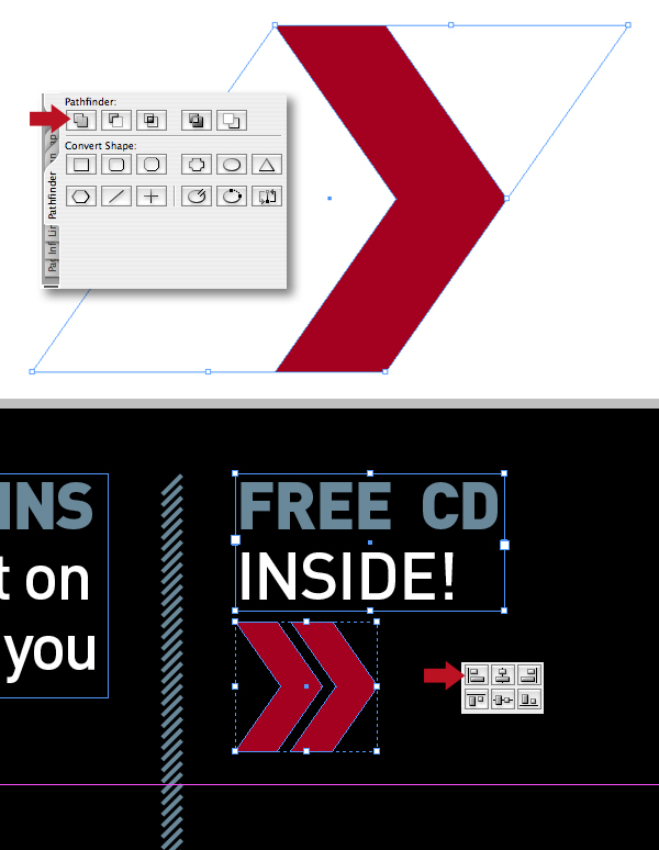
Select both objects, then click on the Add icon in the pathfinder palette to create a compound shape. Now duplicate the shape by Option + Shift + dragging to the right. Group both shapes, resize and align to the text bottom right as shown.
Step 19
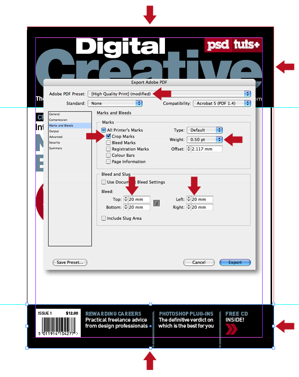
We're now going to generate a PDF which will serve as a template for the Photoshop illustration. Press Command + E and select High Quality Print in the Preset drop down menu. Next, select just the Crop Marks giving them a Weight of 0.50pt, then add 20mm Bleed all round and click Export.
Step 20
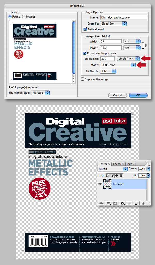
Import the PDF into Photoshop selecting Bleed Box in the Crop To drop-down menu and checking Anti-aliased. Ensure the Resolution is set to 300 pixels/inch and in RGB Mode, then click OK to open it in Photoshop and name the layer "Template." Ultimately, we'll be converting to CMYK mode for print, so hit Command + Y to enable CMYK preview – this will avoid any unexpected color shifts when it's changed.
Step 21
At this point you're probably thinking there's way too much bleed, but from experience it's always good practice to add too much rather than too little. It leaves more room for maneuver when placing into InDesign, especially as additional coverlines are sometimes added at the last minute.
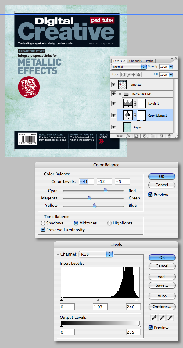
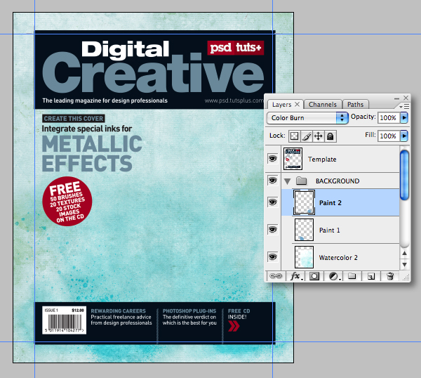
Add a group folder below the "Template" and label it "BACKGROUND." Now open the "Stained_paper.jpg" from the "source" folder and Shift-drag its thumbnail into the folder as a new layer and name it "Paper." Add a Color Balance adjustment layer above the "Paper" setting the Midtone Cyan to +41, Green to -12 and the Blue to +5. Next add a Levels adjustment setting the Input Level midpoint to 1.03 and the whitepoint to 246.
Step 22
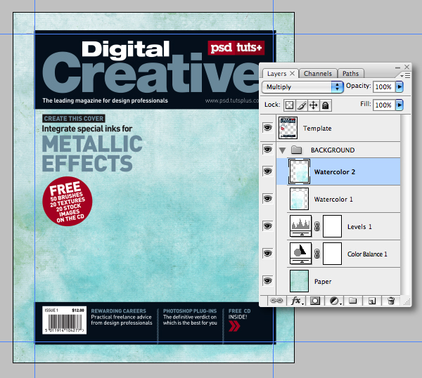
Drop in "Wash.jpg" from the "source" folder above the adjustment, then set the Blending Mode to Multiply and label it "Watercolor 1." Duplicate, then go Edit > Transform > Flip horizontal and name it "Watercolor 2." Now position both layers as shown.
Step 23
Add "Splat_1" and "Splat_2" from the "source" folder above the watercolors. Position as shown, then set their Blending Modes to Color Burn and label them "Paint 1" and "Paint 2."
Step 24
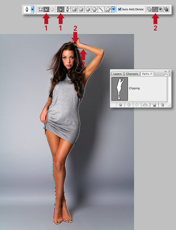
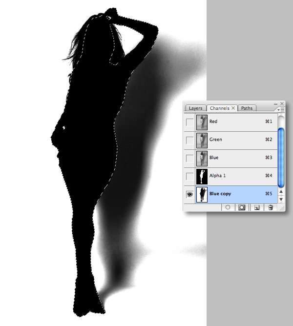
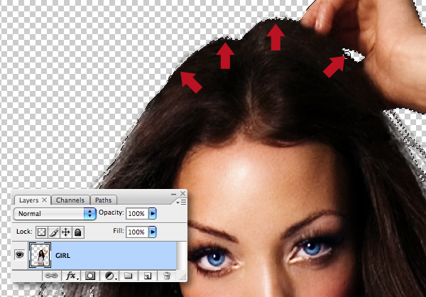
Set the illustration file to one side, because next we need to isolate the model. Open the girl image, then use the Pen Tool (P) set to Paths to carefully plot around the figure ignoring the hair (1). Now set the Pen Tool to Subtract from path area to draw the two inner paths (2). When you're done, double-click and name the path "Clipping."
Remember, when creating paths to zoom in and use the Option, Command and Shift modifier keys as you work. Plus you can always fine-tune your path by pressing Command to access the Direct Selection Tool and adjust individual direction/anchor points as required.
Step 25
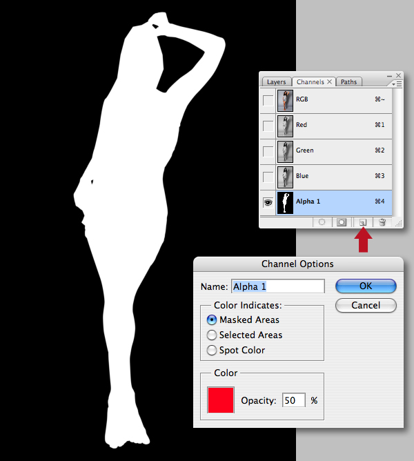
Command-click the path thumbnail to generate a selection, then add a new channel by clicking on the Create new channel icon at the foot of the palette. Double-click the new channel thumbnail and ensure the Masked Areas option is checked. Now with black set as your foreground color and hit Delete to fill the active selection with white.
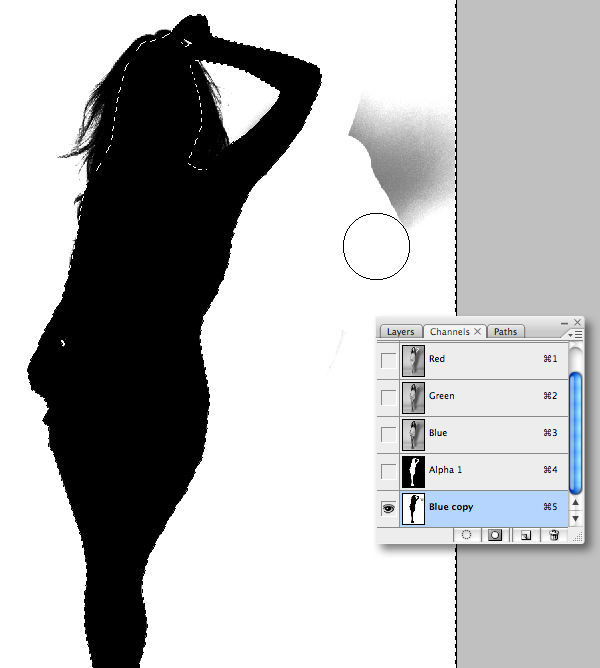
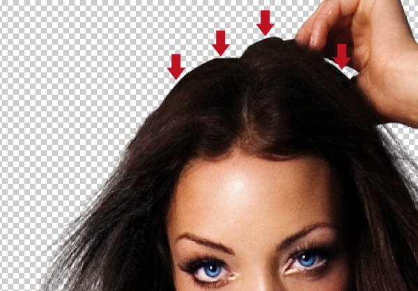
Step 26
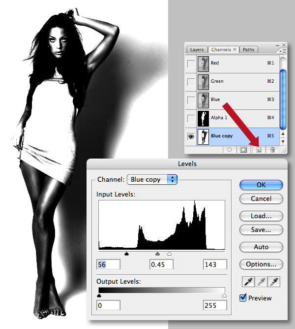
Now to mask the hair. Duplicate the Blue channel (which holds the most contrast) by dragging its thumbnail into the Create new channel icon. Increase the contrast of the duplicate channel by pressing Command + L to access Levels and set the Input Level blackpoint to 56, the midpoint to 0.45 and the whitepoint to 143.
Step 27
Command-click the "Alpha 1" thumbnail to generate a selection, then target the "Blue copy" channel and hit Alt + Delete filling the selection with black – don't deselect just yet.
Step 28
Inverse the selection (Shift + Command + I), then select the Brush Tool (B) and use a hard-edged, white brush to remove any background areas.
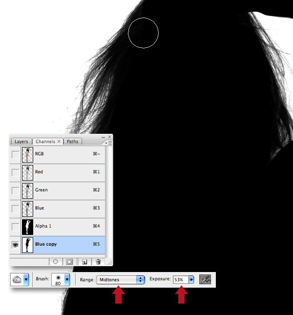
Step 29
Zoom in and use the Burn Tool (O) set to Midtones and an Exposure of 53% to darken the edges of the hair.
Step 30
Generate a selection from the channel, then target the top RGB composite channel. Now switch to your layers palette, then hit Command + J to float the selection as a new layer. Finally, disable the visibility of the underlying layer to ensure the channel mask has done a good job.
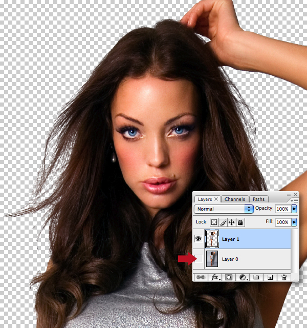
Step 31
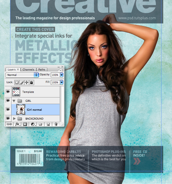
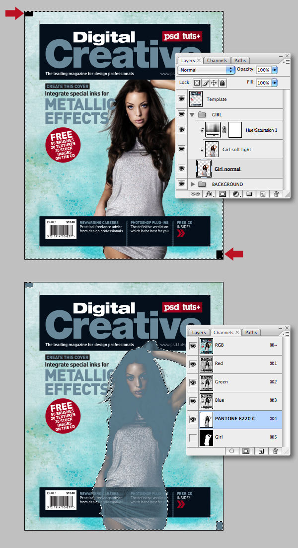
Drag/drop the layer into your illustration file and label it "Girl normal." Create a new folder, named "GIRL" below the "Template" and place the layer into it. Now hit Command + T to Transform. Also, lowering the Opacity of the "Template" layer will help you position it as shown.
Step 32
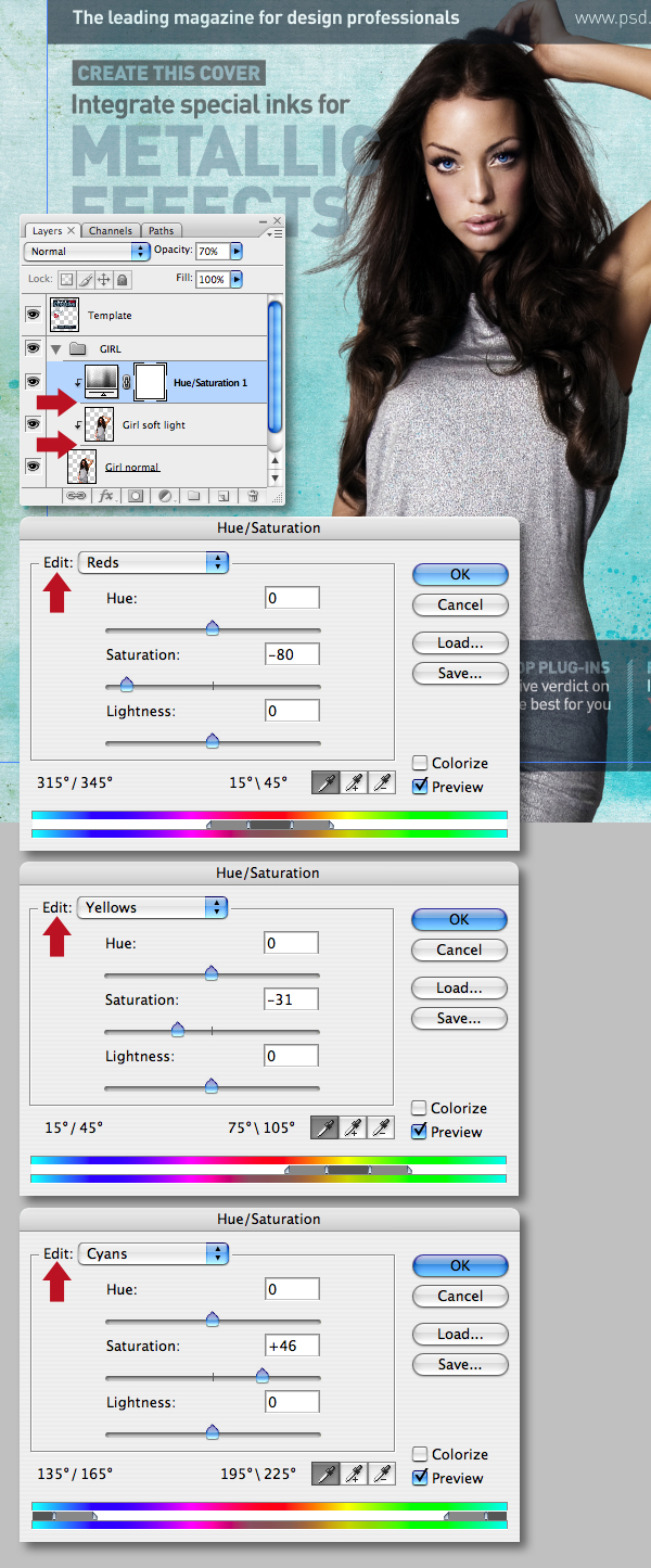
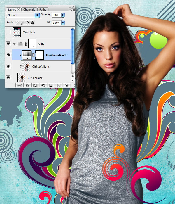
Duplicate the "Girl normal" layer by dragging its thumbnail into the Create new layer icon. Set the Blending Mode to Soft Light, drop the Opacity to 63% and label it "Girl soft light." Add a Hue Saturation adjustment layer and use the Edit drop-down menu to set the Reds, Yellows and Cyans as shown. Next, set the adjustment layers' Opacity to 70%, then click between the layer thumbnails to clip the adjustment to the two underlying layers.
Step 33
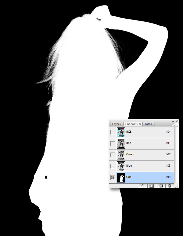
Command-click the "Girl normal" layer to generate a selection. Switch to your channels palette, add a new channel, fill the selection with white and label it "Girl."
Step 34
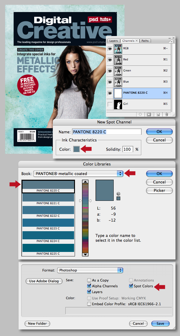
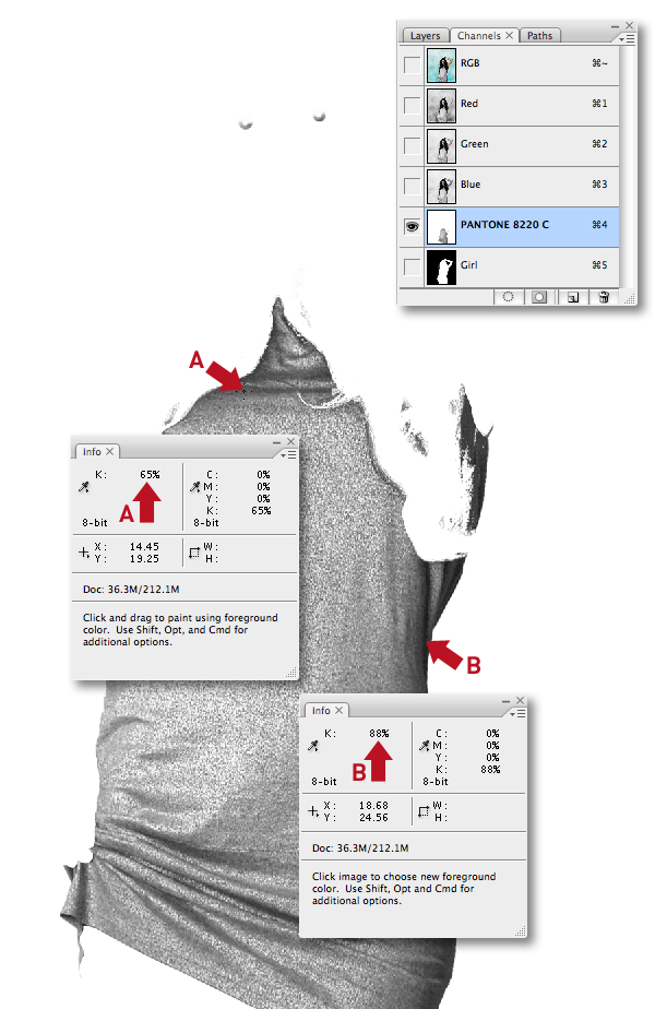
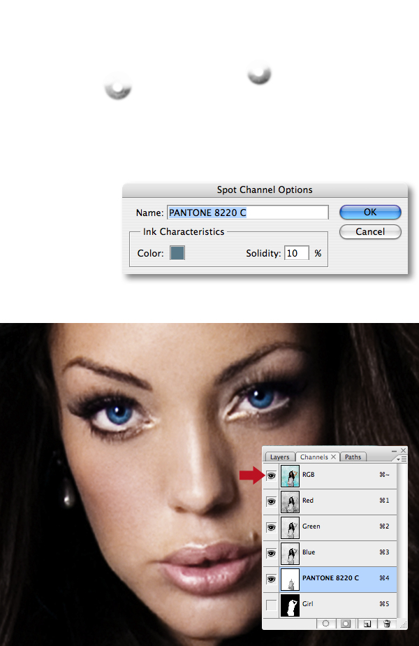
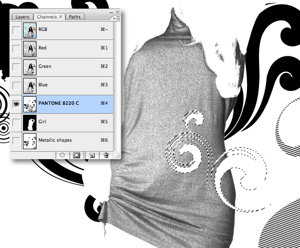
Add the metallic channel by selecting New Spot Channel in the top-right fly-out menu. In the next window click on the color chip, which opens another dialogue box. Select PANTONE metallic coated from the drop-down Book menu, then PANTONE 8220 C (which is a blue/silver metallic), then click OK.
At this point it's a good idea to save – as it's important to check the Alpha Channel and Spot Color options are selected. Also refer to a metallic PANTONE swatch book when choosing your spot color, don't just rely on its on-screen representation. If you don't have one, ask your printer. Remember there's a whole spectrum of metallics – you don't need to limit yourself to just silver or gold.
Step 35
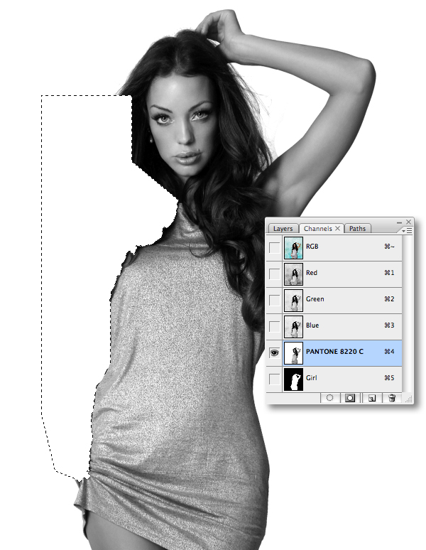
We now need to duplicate selective parts of the figure into the metallic channel. A straight Copy and Paste will not align correctly, because there's image information extending beyond the canvas. Use the Rectangular Marquee Tool (M), snapping to the canvas edges to add a couple of temporary black blocks on opposing corners on the "Girl normal" layer. Next, Select All and Copy, switch to the channels palette, target the “PANTONE 8220 C“ channel and Paste..
Step 36
We only need the models' dress and eye information in the metallic channel. Begin plotting paths around the hard-edged area as shown, generate a path-based selection and fill with white.
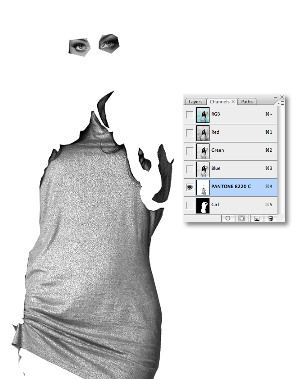
Step 37
Continue erasing areas with paths until it looks something like this. We'll be refining areas where the hair meets the dress in the next few steps.
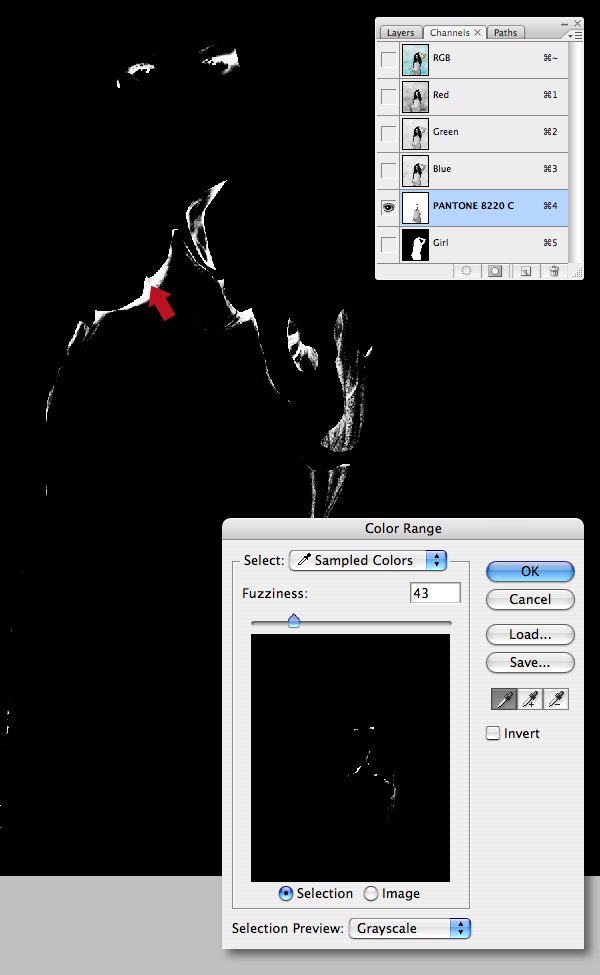
Step 38
Go to Select > Color Range, then click on the image as shown, setting the Fuzziness slider to 43 and clicking OK.
Step 39
Paint within the selection to remove the hair using a white brush. To achieve a soft edge you can also paint directly on the channel after deselecting. As the CMYK inks will sit over these silver areas, it's best if the midtone areas contain 30% or more and the darkest areas contain no more than 90%. This can be checked using the info palette and hovering over the image with the eyedropper. You can always apply a Levels adjustment if your percentages are higher.
Step 40
The eyes now need a little more work. Use a soft-edged white brush to remove the dark pupil area. Now toggle the visibility of the composite RGB channel to see the effect of the metallic channel. You can now adjust the channels' appearance by double-clicking its thumbnail and dropping the Solidity setting – I used 10%. Modifying this setting does not alter how the ink will print, it's purely for previewing – and the percentage used gives a pretty good indication of how the ink will sit.
Step 41
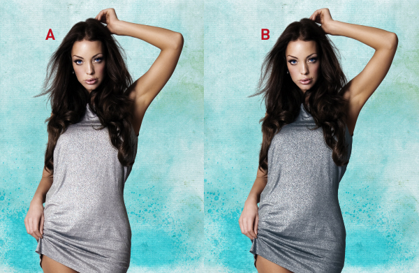
Image A shows the channels' visibility disabled and image B shows it enabled – see how the metallic slightly darkens the models' dress and eyes.
Step 42
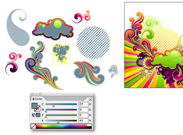
Open the vector flourishes in Illustrator, then duplicate your chosen shapes. Fill some of the smaller shapes with the CMYK equivalent of the metallic (25% Cyan and 40% Black). Now fill selective areas on some of the larger swirls. Don't go overboard, these areas will eventually become metallic, so it's good to have some CMYK areas for contrast.
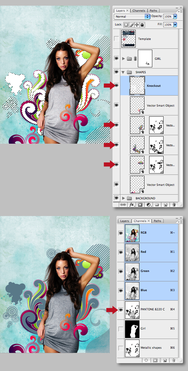
Step 43
Start to Copy and Paste (as Smart Objects) the smaller objects into a new folder labelled "SHAPES" positioned below the "GIRL" folder. You can drop the Opacity of the "Template" layer to help with positioning.
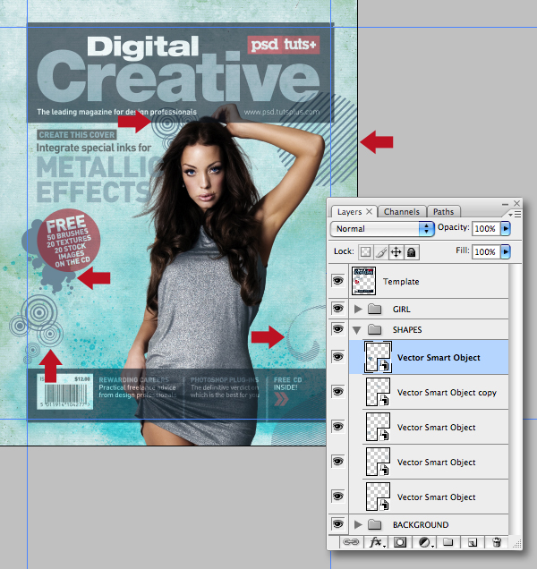
Step 44
Continue to add the larger flourishes around the model. Feel free to transform them to fit the layout. I've avoided placing any metallic areas near to the main coverline to keep it prominent, as later this will print metallic.
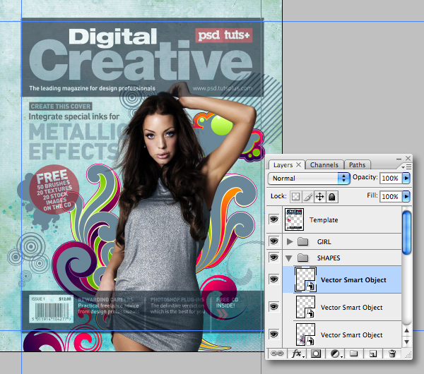
Step 45
Add masks to any layers where objects overlap.
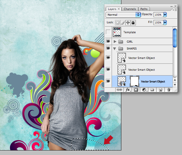
Step 46
Allow some small flourishes to overlap the girl by generating a selection from the chosen shape. Target the "GIRL" folder, then go Layer > Layer Mask > Hide Selection.
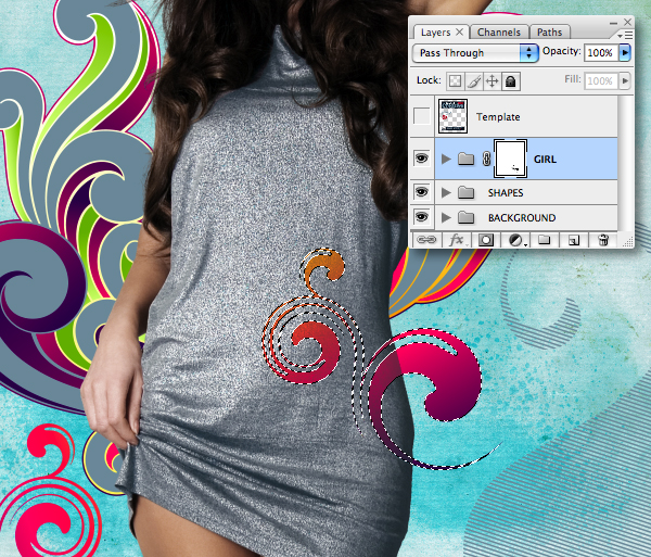
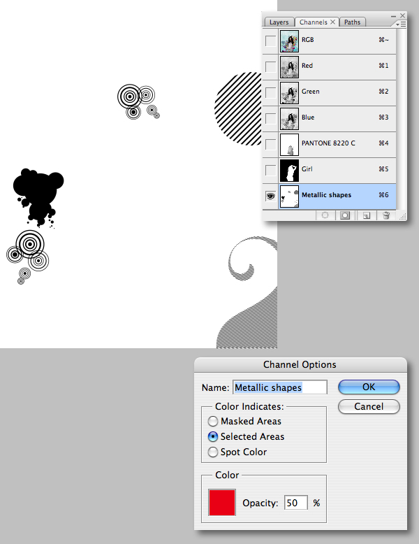
Step 47
Add a new channel (not Spot Color), then double-click its thumbnail and check Selected Areas and name it "Metallic shapes." Now generate selections from your smaller shape layers and fill with black on the new channel.
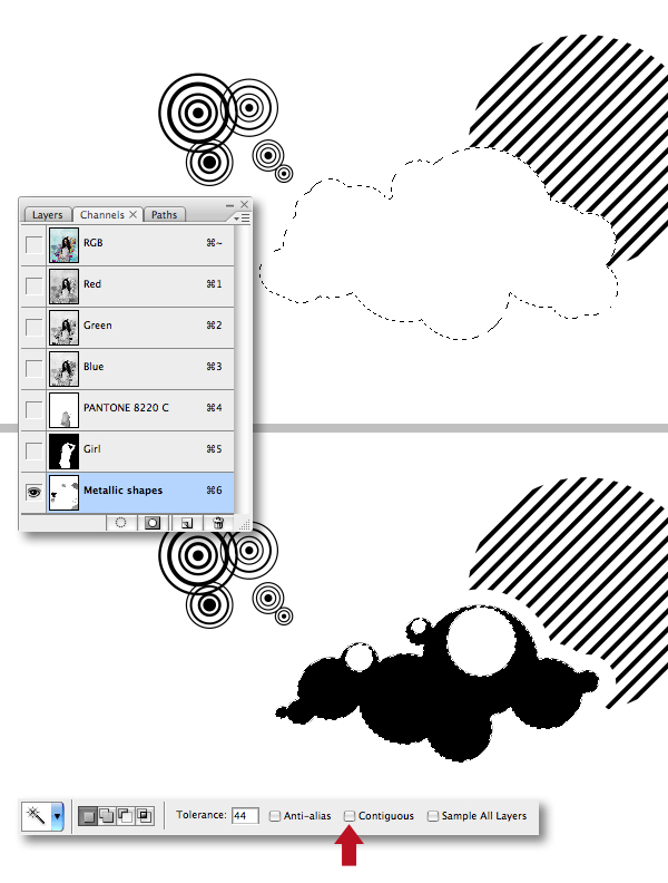
Step 48
Make selections from further shape layers and fill with white to chop away any overlap areas. Also generate selections with the Magic Wand Tool, set to Contiguous to add further black areas.
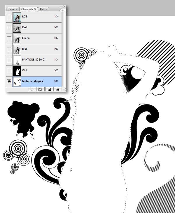
Step 49
When you're done adding the black areas, generate a selection from the "Girl" channel and fill with white on the "Metallic shapes" channel, don't deselect just yet.
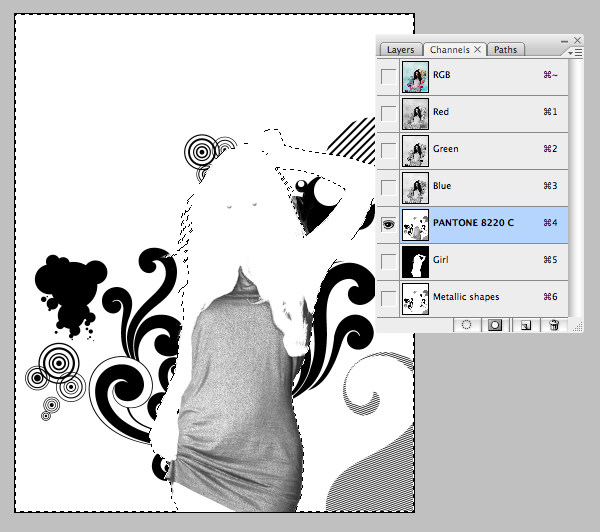
Step 50
Ensure your "Metallic shapes" channel is targeted, then Inverse the active selection and Copy. Now target the "PANTONE 8220 C" and Paste. Disable the visibility of the other channels and it should look something like this.
Step 51
Next we'll knock out some of the "PANTONE 8220 C" channel by generating a selection from the overlap shape layer and filling with white.
Step 52
Delete the smaller shape layers that were completely filled with the CMYK metallic (see Step 43). Now generate a selection from the "Metallic shapes" channel, target each of the remaining shape layers in turn and go Layer Mask > Hide Selection – this has now revealed the "PANTONE 8220 C" channel areas.
Next, make a selection from the "Metallic shapes" channel again. Add a new layer at the top of the stack within the "SHAPES" folder and label it "Knockout," now fill the active selection with white. If you toggle the visibility of the "PANTONE 8220 C" channel and the "Knockout" layer you'll see RGB areas have been punched out, allowing the metallic to show through.
Step 53
The illustration is almost finished, but as a final tweak drop the Opacity of the girls' Hue/Saturation adjustment layer down to 30%.
Step 54
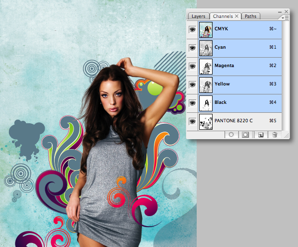
Be sure to Save, then delete the "Template" layer. Now flatten all layers and convert to CMYK (Image > Mode > CMYK). Delete the "Metallic shapes" and "Girl" channels and Save As "Cover_illustration.tif" ensuring Spot Colors are checked.
Step 55
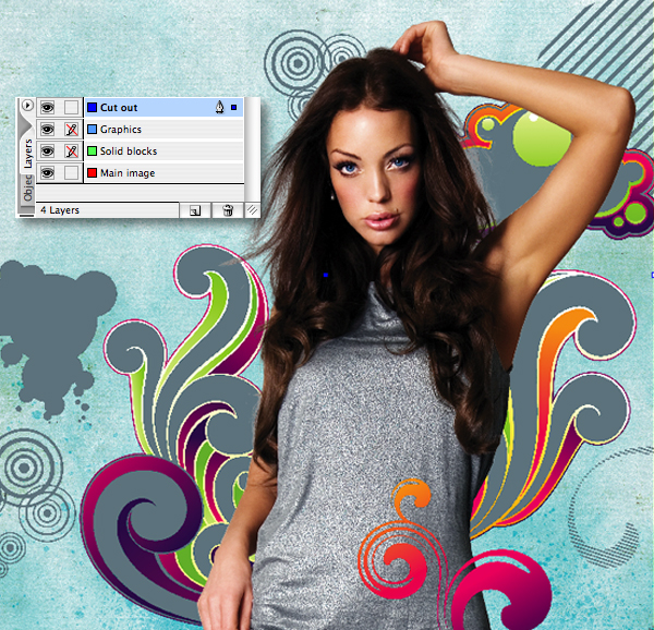
Switch to your InDesign file and add a new layer called "Main image" beneath the default one. Add another layer at the top and label it "Graphics." Now select all your artwork except the black bars and move them to this layer with the pointer icon (located right of the layer thumbnail). Rename the original default layer (which should now only contain the black bars) "Solid blocks."
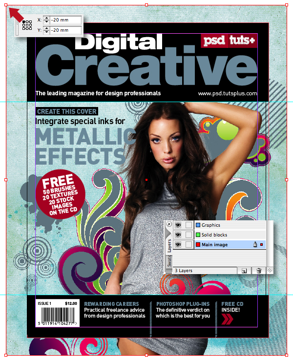
You can now Place the illustration on the "Main image" layer setting both coordinates to -20mm (remember we gave the illustration the same bleed in Step 19). Also get into the habit of locking layers you're not working on to avoid accidentally moving objects.
Step 56
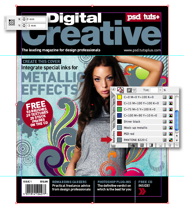
Drag/snap the corners of picture box to the document bleed using the Selection Tool, then check the coordinates again. Now if you examine the color palette, you'll see the placed illustration has also imported the "PANTONE 8220 C" swatch.
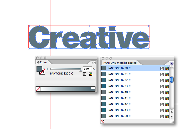
Step 57
Open the "Masthead_outlines.eps" in Illustrator using the links palette, then load the same PANTONE metallic swatch library. Now recolor using the same "PANTONE 8220 C" swatch and Save.
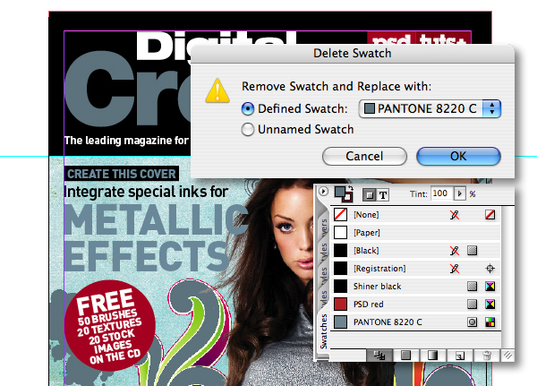
Step 58
The linked file should now update automatically, if it doesn't click the Update Link icon. Now drag the "Mock-up metallic" swatch into the trash, in the next window select "PANTONE 8220 C" to replace it. Now all instances of that swatch have been updated.
It's also a good idea to get rid of any unused swatches by choosing Select All Unused in the palette pop-out menu (located top-right) and trashing them too.
Step 59
Open the to CD image and select the Ellipse Custom Shape Tool (U) set to Paths and Shift-drag a circle. Don't sweat if you don't get the size and position right, you can reposition it by selecting with the Path Selection Tool (A) and pressing Command + T to scale it. Next set the path option to Subtract from path area to draw the inner circle.
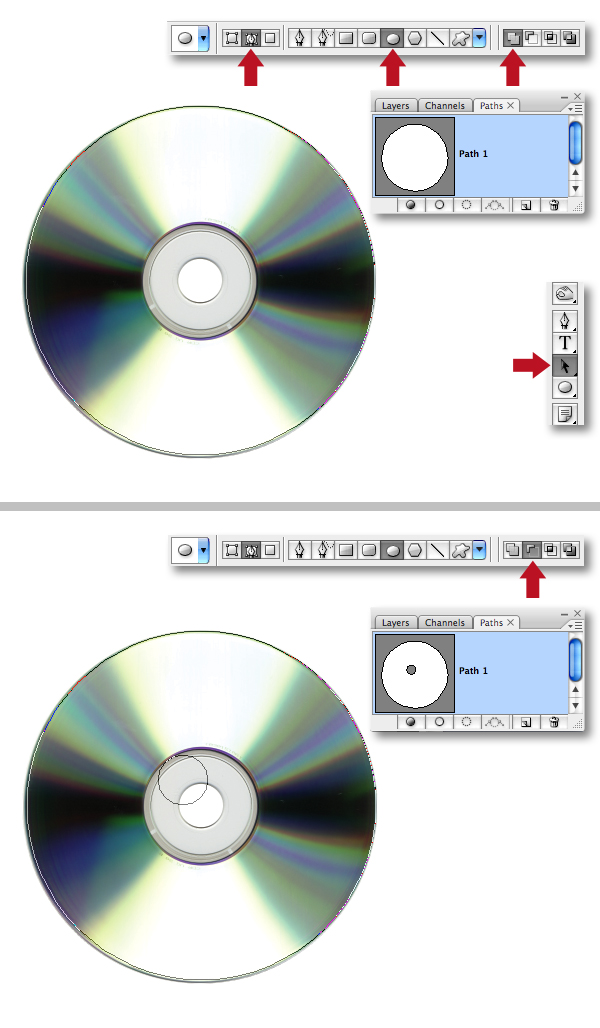
Step 60
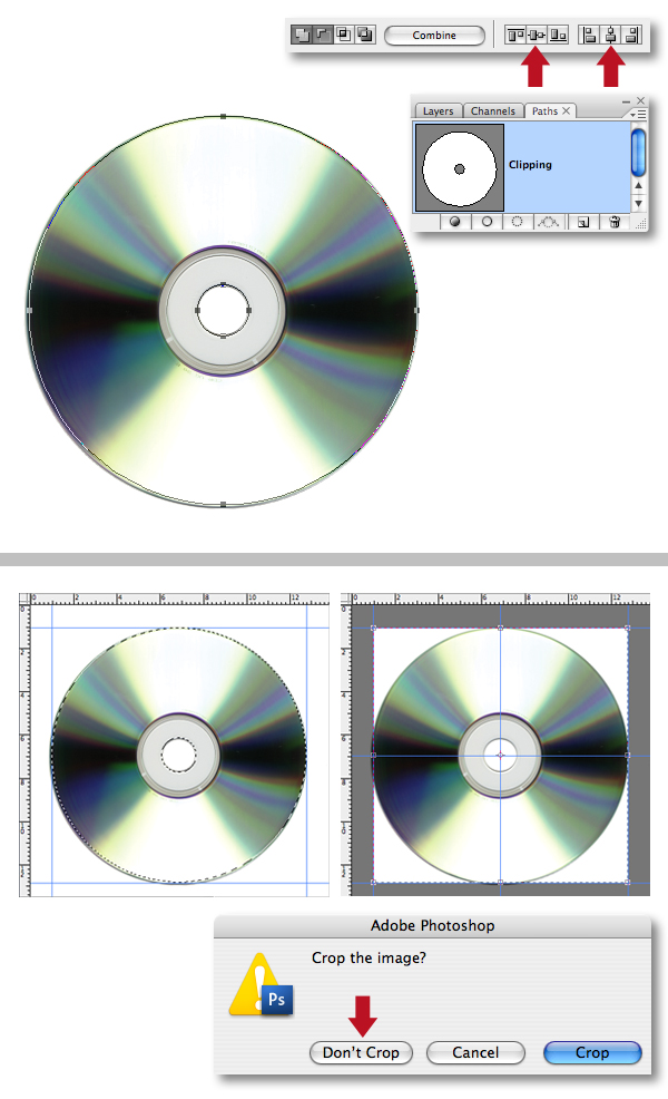
Shift-click both paths with the Path Selection Tool, then click both central align options. We now need to add some central guides. A quick tip to do this is to generate a path-based selection and snap guides to it. Now snap the Crop Tool (C) to the guides, then drag in central guides which again snap to the crop. Finally, you can cancel the crop prompt.
Step 61
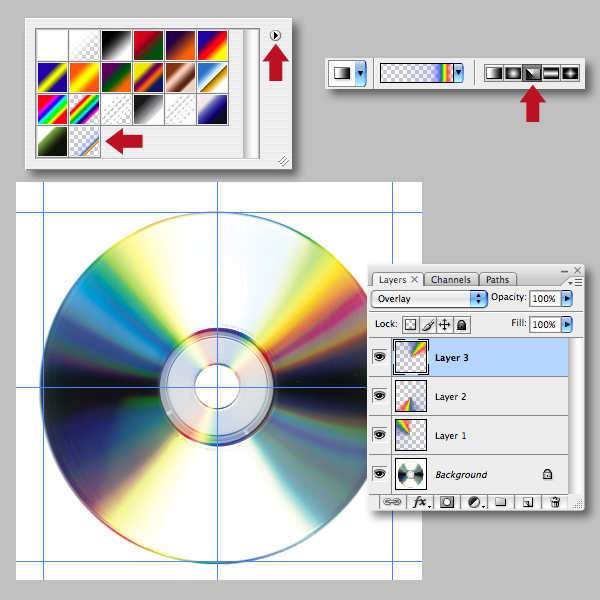
The CD looks a little bland, so let's add some more color. Select the Gradient Tool (G), then load the "Special Effects" library from the fly-out menu. Choose the "Russel's Rainbow" gradient and using the Angle Gradient preset drag a gradient from the center on a new layer, then set the Blending Mode to Overlay. Add more gradients, again in Overlay mode on separate layers to build up the effect.
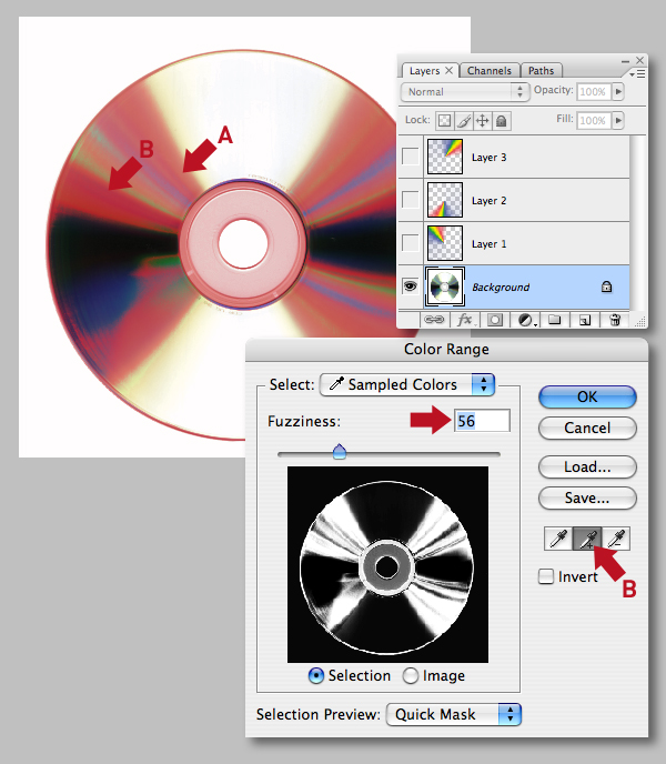
Step 62
Disable the visibility of the gradients, then make a selection from the base layer using Color Range. First, set the Fuzziness slider to 56, click on point A, then select the Plus eyedropper icon and click on point B to add to the selection.
Step 63
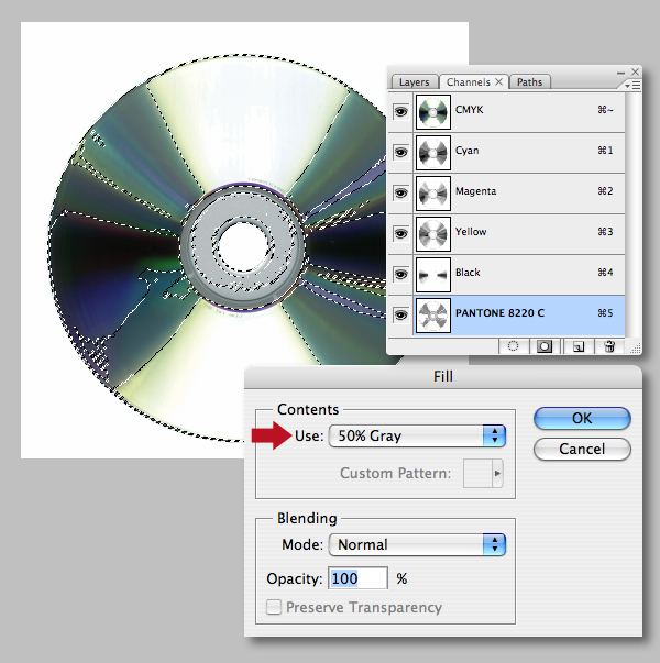
For some metallic sparkle, add a spot channel using the same "PANTONE 8220 C" as previous. With the selection still active and the new channel targeted, hit Shift + F5 to bring up the fill options and select 50% Gray under the Contents menu.
Step 64
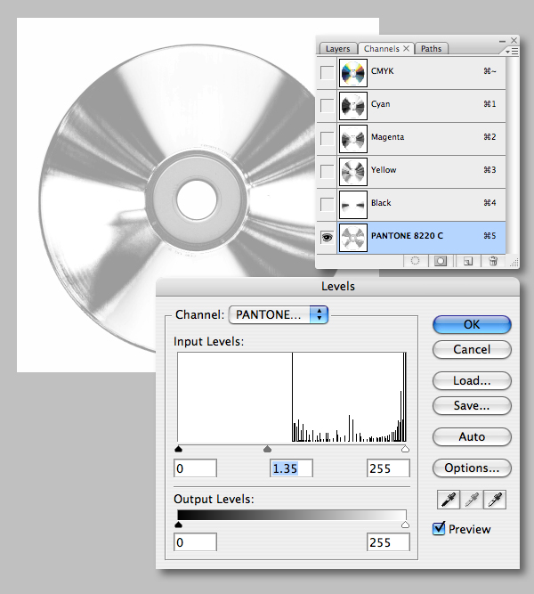
Knock back the strength of the channel by adding a Levels adjustment, setting the midpoint slider to 1.35.
Step 65
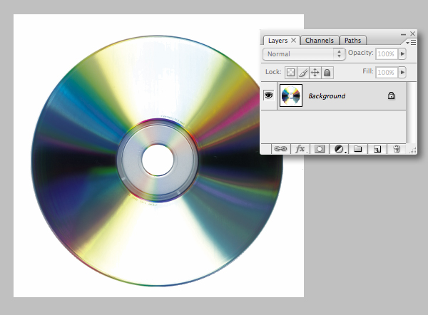
Enable the visibility of the gradients and flatten. Now go to Image > Mode > CMYK, then hit Shift + Command + I to check the resolution is set to 300dpi. Finally, save a version as "CD.tif."
Step 66
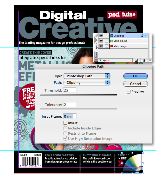
Place the "CD.tif" on the "Graphics" layer, then resize and position as shown. Now hit Option + Shift + Command + K to access the Clipping Path dialogue box and select the embedded Photoshop Path.
Step 67
We now require a separate Photoshop file of the girl, so her head and left hand can encroach into the header bar. Open your layered "Cover_illustration.psd" and delete all folders/layers apart from the "GIRL" folder. Now press Shift + Command + E to Merge Visible, then convert to CMYK and delete all the extra channels leaving just the CMYK.
Step 68
Generate a selection from the layer, then use the Clone Tool (S) to carefully fill any transparent gaps around the top of the hair.
Step 69
Select the Eraser Tool (E) and use a small, hard edge to give the top of the hair a definitive edge. Now Save As "just_girl_illustration.psd," ensuring it's in the native Photoshop (PSD) format.
Step 70
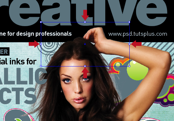
Back in your InDesign file, select and Copy the "Cover_illustration.tif." Add a new layer at the top of the stack and label it "Cut out," then " Press Option + Shift + Command + V to Paste in Place.
Step 71
Pull the handles of the picture box in as shown, so just the required areas break the header bar.
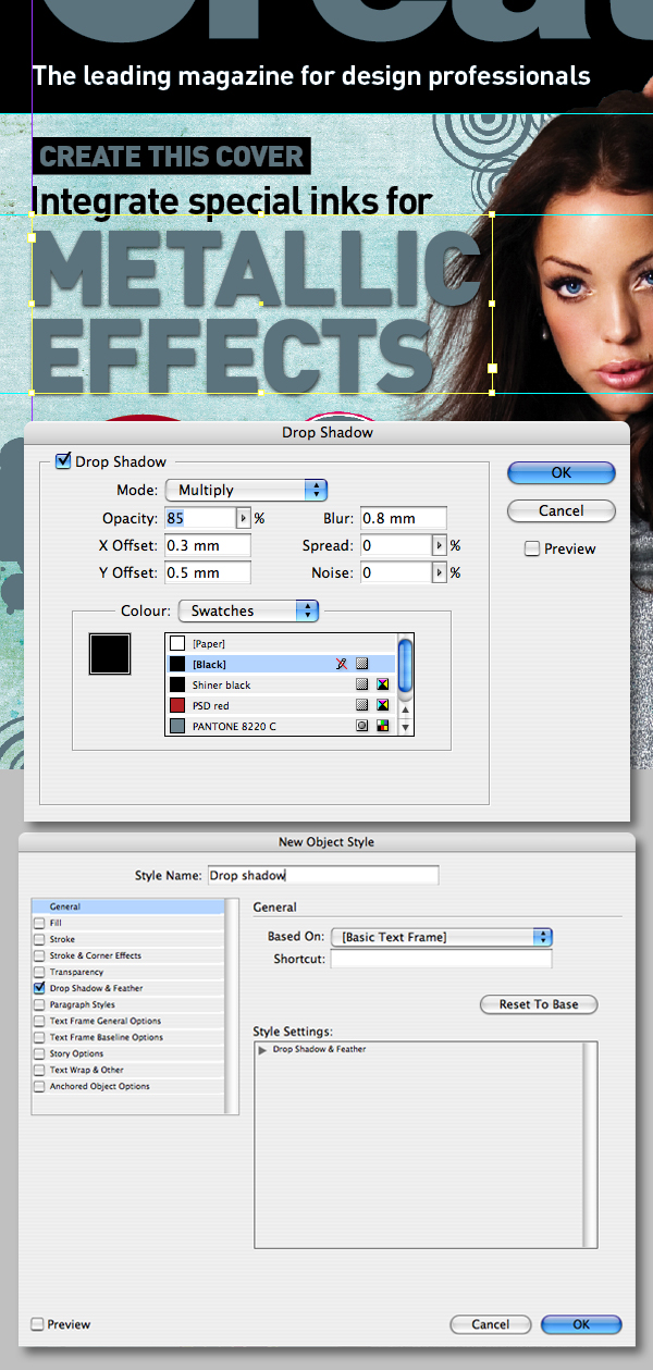
Step 72
Now make chosen elements of the design pop – such as a shadow on the main coverline. Cut and Paste the black text into a new text box (we only want the shadow on the metallic text). Now press Option + Command + M to access the Drop Shadow dialogue box and use the settings shown.
You can now save the effect by selecting the New Object Style in the fly-out menu in Object Style palette and label accordingly.
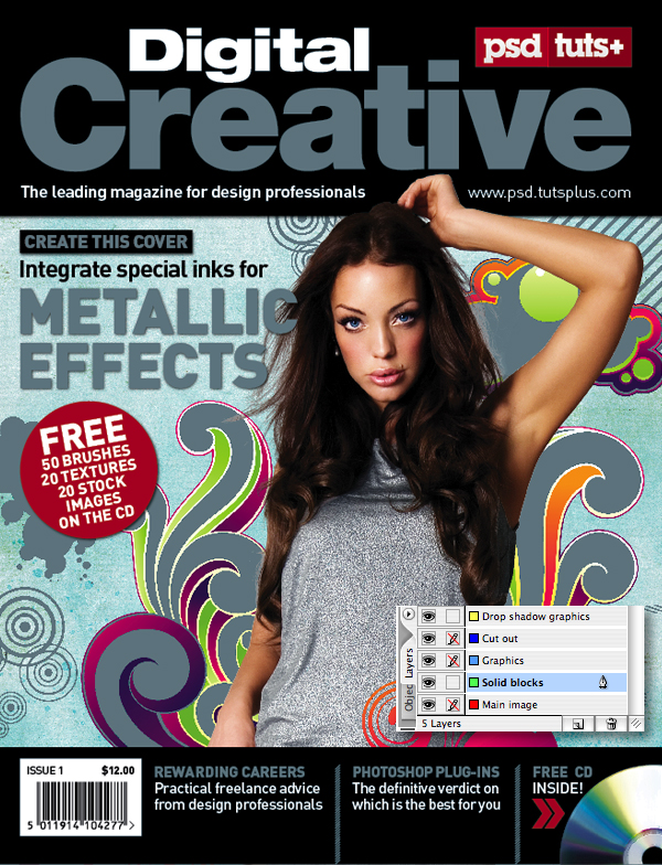
Step 73
Select the red circle with the Direct Selection Tool (A) and apply the same drop shadow style. Feel free to use the same settings on other elements. But remember these effects can be problematic if not understood correctly.
Every time you apply such an effect it creates an area of transparency that will rasterize surrounding elements such as text. To avoid such issues, always move these objects to a new layer. You can see all mine have been moved to an uppermost layer named "Drop shadow graphics" – except the top black header bar which is fine where it is.
Step 74
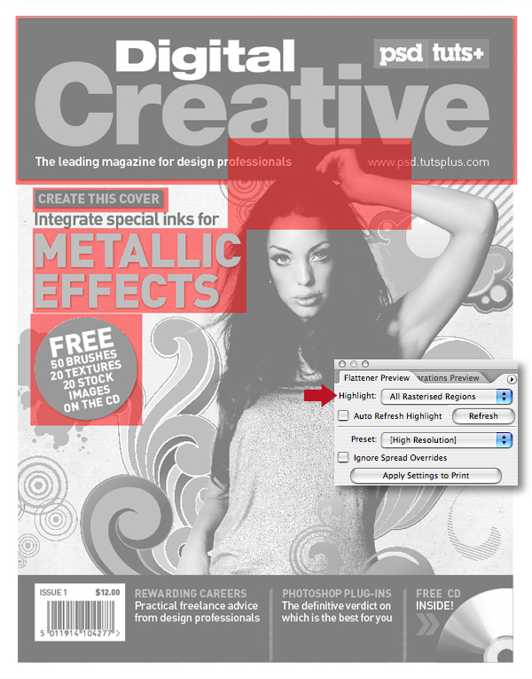
InDesign has a cool feature to check your artwork will print correctly – hit Shift + F6 to open the Separations Preview window. Then select Separations in the drop-down View menu and toggle the visibility of the CMYK and spot inks.
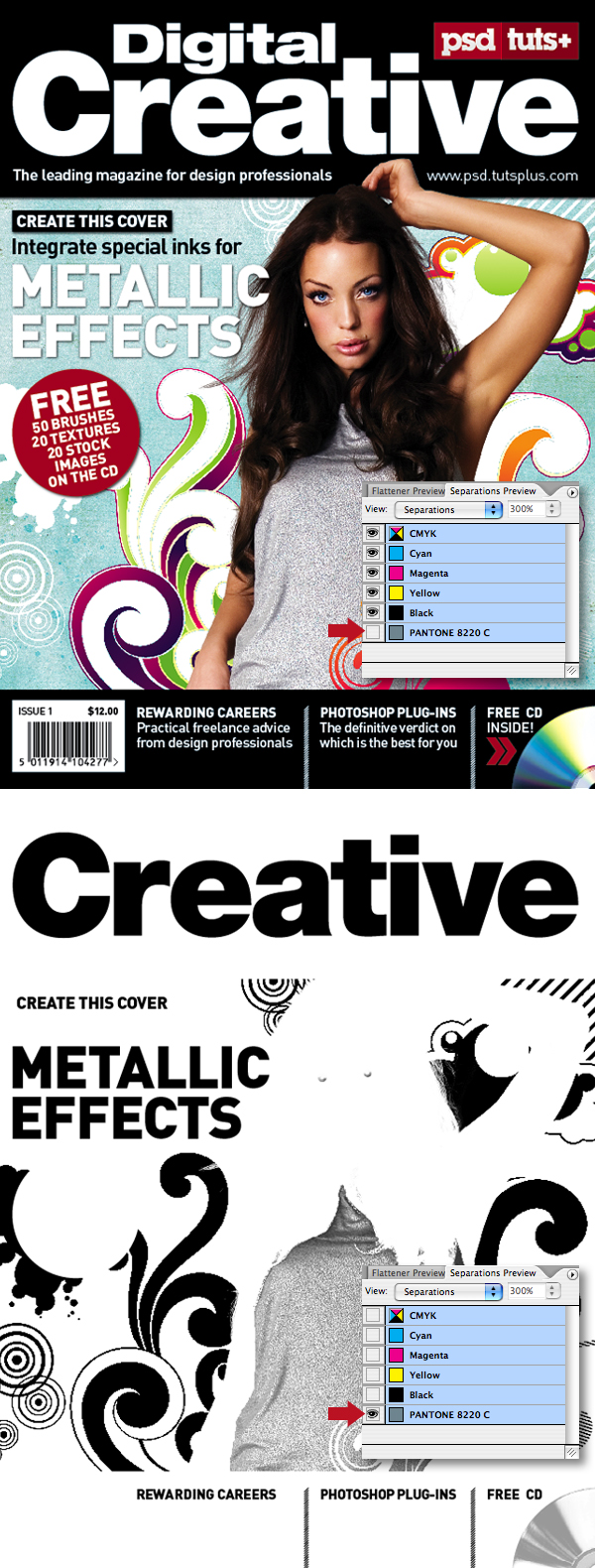
Step 75
Now select the Flattener Preview tab in the same window and select All Rasterized Regions in the Highlight drop-down menu. This will highlight any areas for concern mentioned in step 73. From this information I saw I'd missed a problem with the two lines of text directly beneath the masthead.
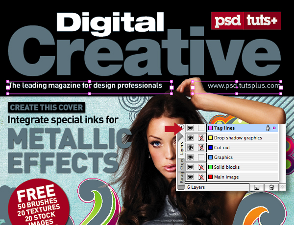
Step 76
These lines were moved to a new layer at the top of the stack and labelled "Tag lines."
Step 77
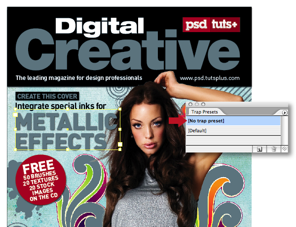
The often misunderstood concept of trapping is a complex one, and best left to the experts. As a golden rulelithographic printers will ignore any frame settings applied to your job – they'll apply their own framing on the RIP using specialist trapping software. You're always best checking with the printer to ensure that they will take care of the framing. After all, this is what you're paying them for.
If a printer asks you to do your own trapping it should immediately ring alarm bells! They may not have bothered to purchase the framing software, or even worse they'll pass the blame onto you if the job goes wrong. Either way, it is a sign of a substandard printer or pre-press house.
Step 78
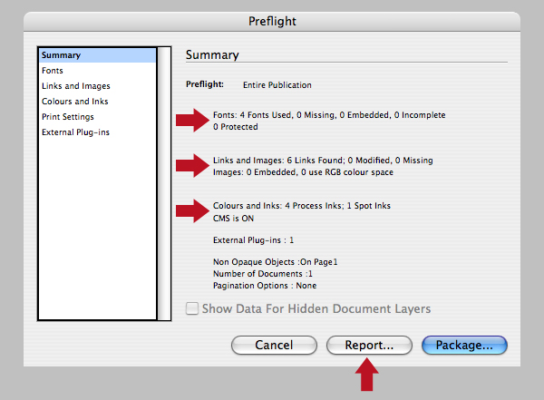
Another precaution is to hit Alt + Shift + Command + F to open the Preflight window. From here you can check fonts; modified or missing links; that there's no RGB images (a common mistake), as well as your four-color and spot inks. Once you're happy, hit the Report button to create a TXT file to accompany your artwork PDF to the printer.
Step 79
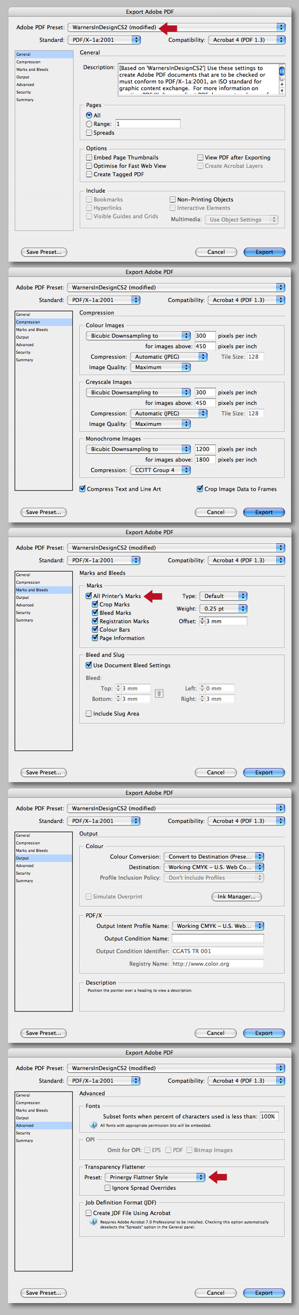
To cover yourself further, ask your printer to supply you with their preferred PDF preset. These can easily be loaded into InDesign by choosing File > Adobe PDF Presets > Define, clicking Load and navigating.
The example below shows an example supplied to me that's never thrown up any problems!
With your PDF preset loaded hit Command + E to Export, choose Adobe PDF from the Format drop-down menu, then hit the Save button.
If you're following this tutorial without using a supplied PDF setting, I suggest using one of the "PDF/X" presets.
Step 80
When the Export process has completed, you can open the PDF with Acrobat Professional for a final check. Select Advanced > Overprint Preview, then Output Preview. You'll now see a window very similar to InDesign's Separation palette. Check the Separations box and you'll see the CMYK, plus the metallic inks.
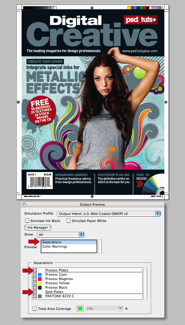
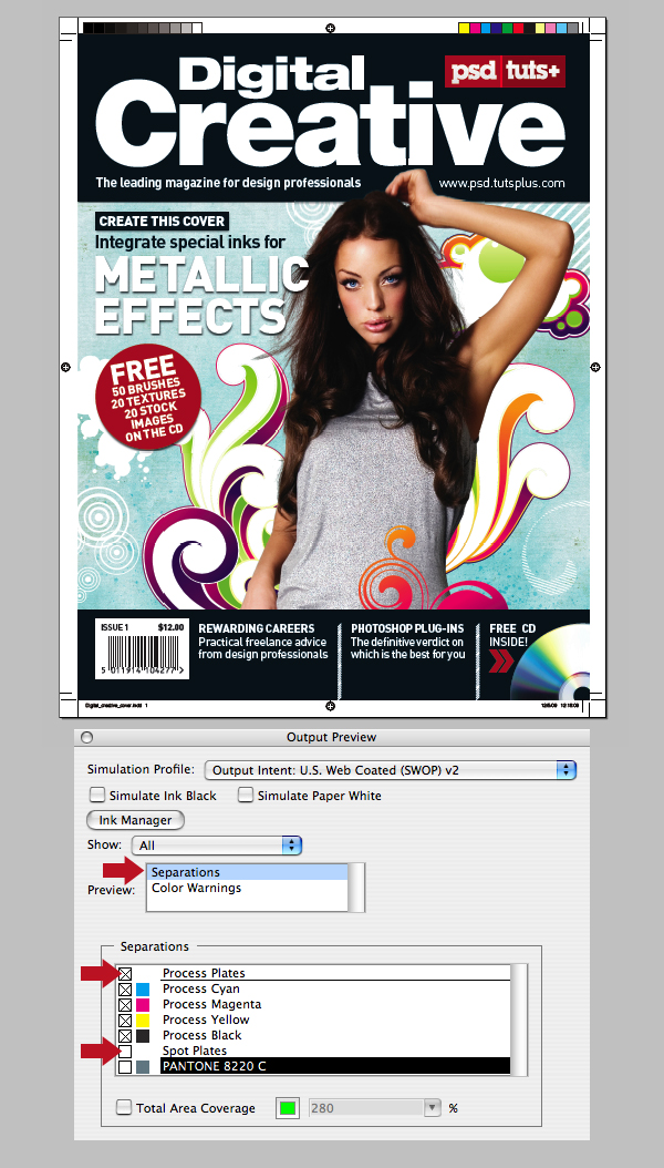
Step 81
Now toggle the visibility of the Spot Plates to make sure everything has exported as it should.
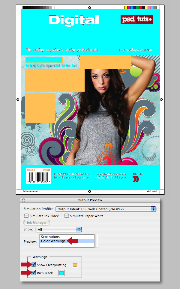
Step 82
Finally, check Color Warnings, as well as Show Overprinting and Rich Black. As long as all your transparent areas are on separate layers, your fine. Now all that's left to do is send the PDF off to print, relax and go and make a coffee!
Step 83
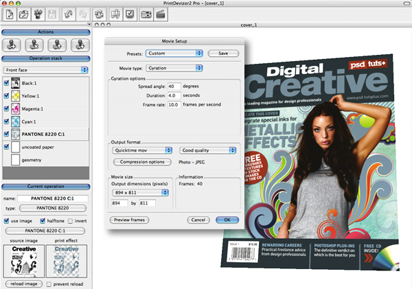
If you incorporate a lot of special inks or print finishes and want to give your client the wow factor – it maybe worth investing in a Esko Visualizer which I used to create the video file shown below. Esko Visualizer allows you to quickly create and share ultra-realistic on-screen mock-ups and soft proofs of complex print finishing effects such as metallics, spot varnishes, foil blocking and embossing by simply loading a PDF.
Conclusion
I hope this tutorial has taken some of the mystery of working with spot colors and metallic inks. I'd also like to thank pre-press expert Richard Ainge for his technical support and checking my files were error free!
'Design' 카테고리의 다른 글
| Crear poster apocalíptico de una película (0) | 2009.06.06 |
|---|---|
| How to Turn Humdrum Photos into Cinematic Portraits (0) | 2009.06.06 |
| Creating a Typographic Wallpaper (0) | 2009.06.06 |
| 2009 해외 쇼핑몰 웹 디자인 트렌드 50선 (0) | 2009.03.12 |
| 골든웨이브 > 보컬 음역 크게 (0) | 2009.03.06 |