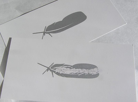
Make your partner work for your contact details. Let them scratch.
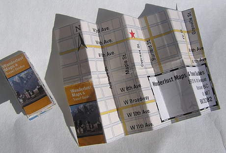
Let them find your easier. Make a mini map.
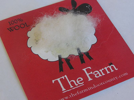
Decorate your card with a bit of fluff.
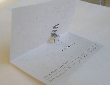
Cute fold out. Brings back old childhood memories.
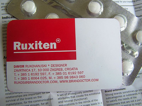
Make it look like the product you're selling.
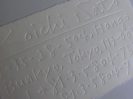
Ooops. It's an impression from my notes.
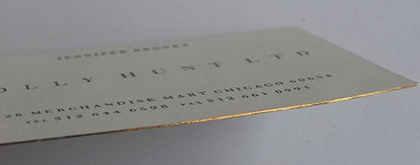
Add a bit of class and expense. Have gilded edges.
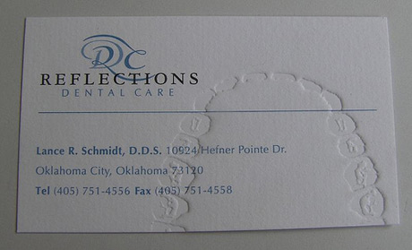
Add teeth impressions if you're a dentist. Thumb prints for a detective. You get the drift.
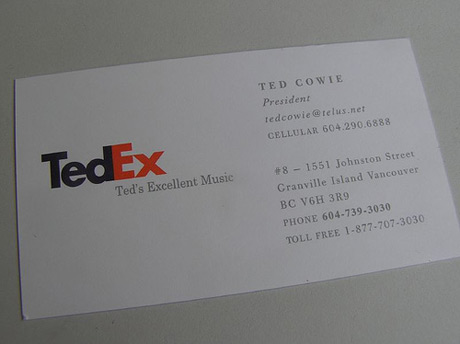
Spoof a famous logo.
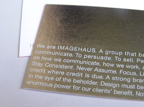
Use shiny metal surface.
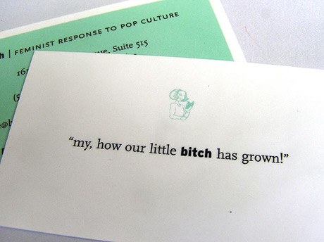
Write fun copy.
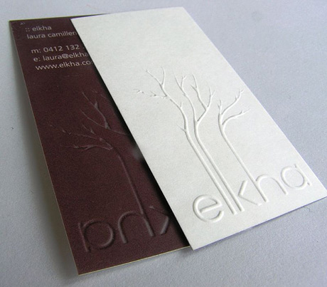
Pay extra for stylish embossing.
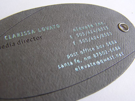
Use metallic ink and a metallic hole.
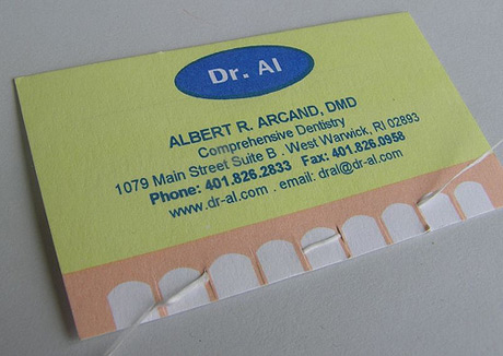
Teeth floss? Gross!
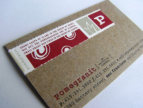
Combine different papers.
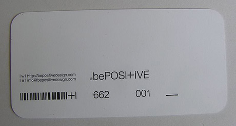
Stay minimal and positive.
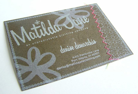
Use a thread.
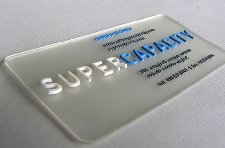
Make an 3D plastic card.
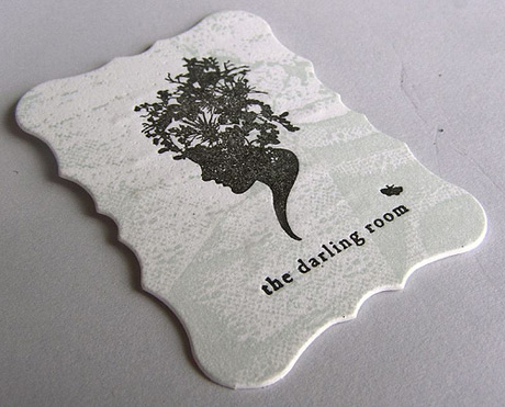
Come up with a fun die-cut.
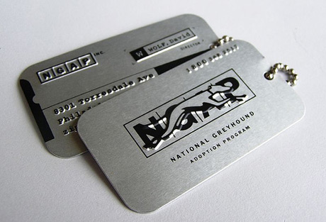
Dog tag theme.
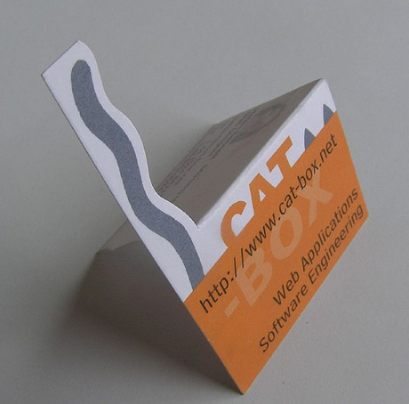
Cat tail theme.
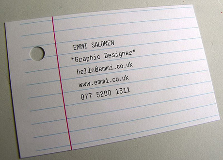
Use office scrap.
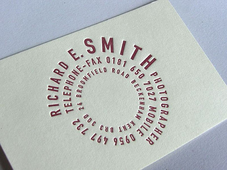
Use fun typography.
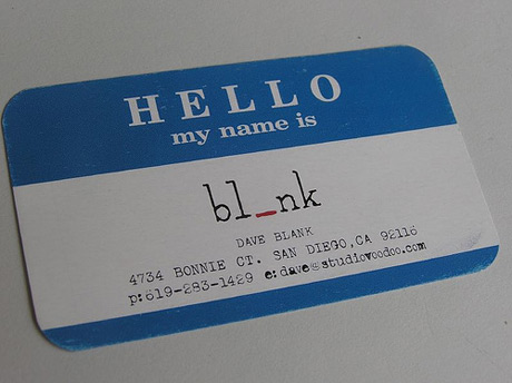
Blind date theme.
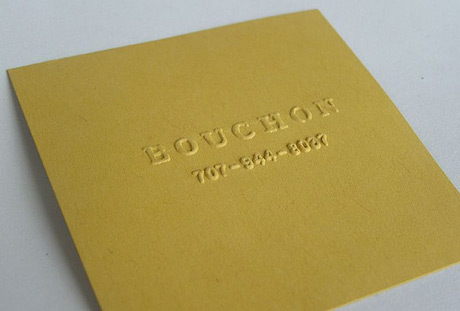
Simply square with no ink.
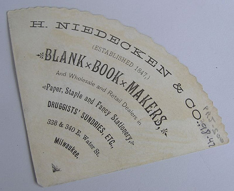
Funky shape.
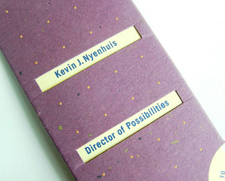
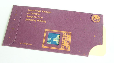
Interchangeable insert in a generic cover.
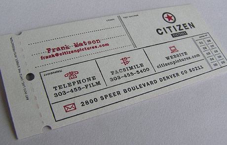
Free one way ticket to the moon.
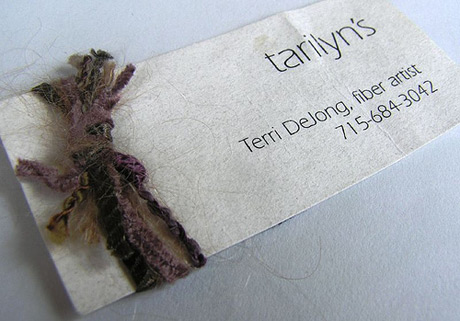
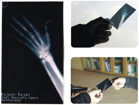
Demonstrate your skill.
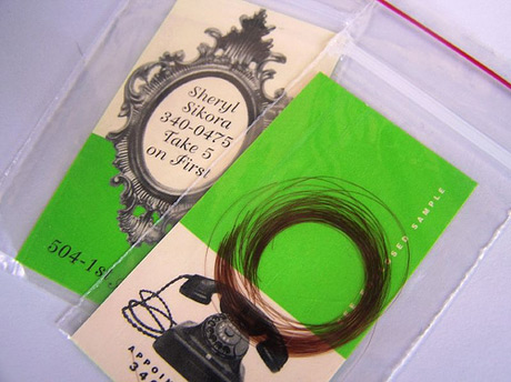
Forensic evidence?
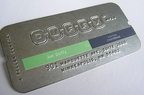
Metal card. Doubles as a cake cutter.
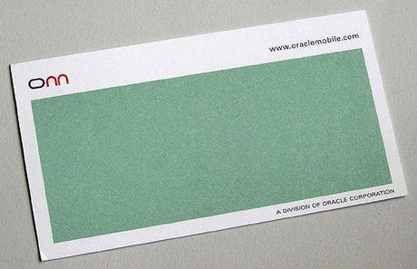
Is this scratch and sniff or just generous use of white space.
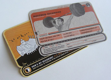
Try the retro look.
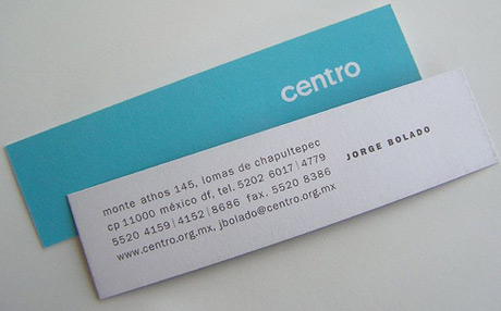
Elegantly long and thin. Reminds me of a card I designed for a perfume shop that looked like a scent tester.
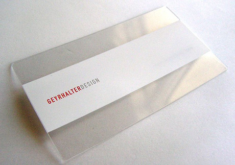
Transparent thin.
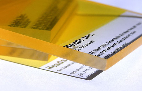
Transparent thick.
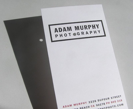
Camera obscura. In case the Nikon breaks it comes handy to get the job done.
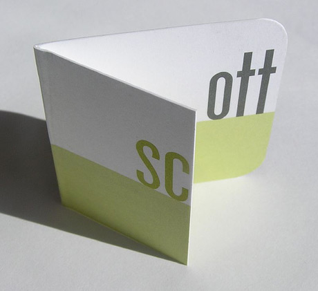
Folded and playful.
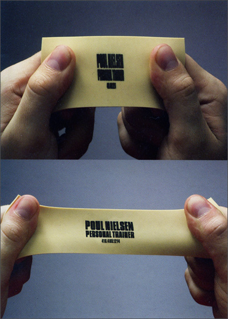
Expandable rubber to test your strength. One more time. And, one more. One last time. Good job. Now, what was the number again?
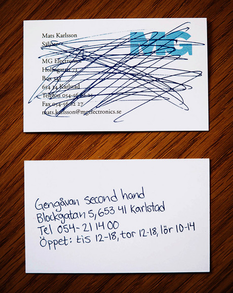
Reuse old cards for a second hand shop.
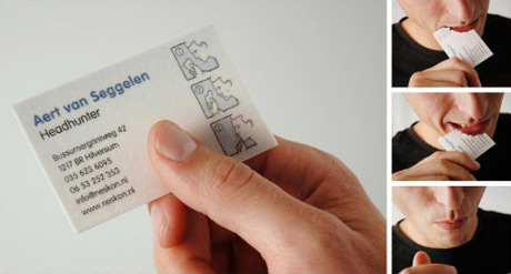
Get rid of the evidence you ever met the headhunter.


'Interesting > D-Style' 카테고리의 다른 글
| 친구 결혼식땜에 못간 애쉬 콘설 후기들 ㅠ.ㅠ (0) | 2007.06.11 |
|---|---|
| 명함 디자인 (0) | 2007.05.16 |
| 노래방 (0) | 2007.05.16 |
| 멘토 낙준햄 장가간다!!!!!!! (0) | 2007.05.16 |
| 내 바탕화면 (0) | 2007.05.04 |